

Hire SaaS Admin Dashboard Designer for Dense Ops UI
Bring on a vetted admin dashboard designer from Devoq Design who redesigns the console your operators and admins inhabit for hours: filterable tables, role-aware views, loading skeletons and export flows that scale as entities multiply. Embedded with product and eng, working in Figma against your existing components, so density improves without dumbing the product down for demos or starving activation work that belongs on a SaaS product designer brief.
 Vetted dashboard design shortlist
- Trial sprint on a real admin surface
- 100% Figma file ownership
- NDA-backed console discussions
Trusted by product and ops teams and rated on independent review platforms





What does a dedicated dashboard designer actually do?
A dedicated dashboard designer shapes information-dense admin and ops consoles: tables, filters, saved views, charts, RBAC presentation, bulk actions and exports. At Devoq Design that designer embeds with your product or ops owner and engineering so dense UI ships with intentional scanability, not a marketing polish pass that hides the data.
The craft spans dense module IA, table column hierarchy, filter and saved-view patterns, chart and KPI composition, progressive disclosure, empty/loading/error skeletons, role-based views, bulk selection and export flows, and annotated handoff eng can extend to new entities. Dedicated designers sit in ops entity reviews, filter debates with eng and staging QA with real row counts. Product and ops owners hire this seat when tables, filters and RBAC presentation are the bottleneck, not when they need a generalist interface owner, a Figma library recovery, or onboarding flows that belong on a SaaS product designer engagement.
Key takeaways
Dashboard design at Devoq Design centers data-density admin and ops UI (tables, filters, saved views, charts, RBAC, bulk actions and exports) not generic “SaaS UI” branding.
Scanability and task completion under load drive decisions; whitespace for its own sake is not the goal when operators live in the console.
Work continues an existing design language and entity model; the brief is not a total product reboot or an activation/onboarding program.
Onboarding, activation and in-product feature UX escalate to the SaaS product designer lane when those journeys (not the console) own the pain.
NDA, IP assignment and Figma ownership are settled in writing before admin file access begins.

 Business Challenges
The console pains that lead teams to hire
Most ops and product owners do not open a tab searching to hire a saas admin dashboard designer for aesthetics alone. They open it when tables become unreadable at scale, filters multiply without saved views, charts decorate screens without answering questions, or every role sees the same destructive bulk actions. These six patterns show up constantly in admin and analytics surfaces, and each has a calmer design response than another sparse UI pass.

Tables that collapse under real row counts
Demos looked fine with twelve rows; production has twelve thousand. Columns compete, actions hide in mystery menus, and power users export to Excel because the UI cannot keep up.
How we resolve it
Redesign column hierarchy, sticky headers, row actions and pagination or virtual scroll patterns for scanability, then validate with realistic data volumes in prototype review before eng commits.
Filter chaos with no saved views
Every operator rebuilds the same filter stack daily. Support documents tribal recipes; onboarding new admins takes weeks because nothing persists.
How we resolve it
Design filter groups, clear reset behavior and saved-view flows so common operational queries are one click, not a Slack thread of screenshots.
Charts that do not answer operational questions
Dashboards show graphs because dashboards should have graphs. KPIs disagree with the table below; nobody trusts the screen during incident response.
How we resolve it
Compose chart and KPI layouts tied to the decisions operators make (aligned defaults, drill paths and table-to-chart relationships) so the canvas supports action, not decoration.
Missing empty, loading and partial-data states
First fetch shows blank white; slow queries feel broken; partial API responses render nonsense. Users assume the product is down when data is simply still arriving.
How we resolve it
Specify skeletons, progressive loading, empty states with next steps and error recovery that preserve filter context, so the console feels reliable under real network behavior.
RBAC shown as one-size-fits-all UI
Viewers see delete buttons; admins miss bulk tools they need. Permissions exist in the backend but the interface pretends every user is a super-admin.
How we resolve it
Design role-based view variants (visible actions, column sets and navigation entries matched to permission levels) so dangerous controls stay hidden without custom builds per customer.
Exports and bulk actions as afterthoughts
Ops teams need CSV handoffs and multi-row updates; eng ships single-row edit because nobody designed selection, confirmation and progress patterns.
How we resolve it
Map bulk selection, action confirmation, async job feedback and export formats as first-class flows, so operational work completes inside the product, not around it.
Why a Dashboard Design HireWhy teams hire for console density before another visual pass
Admin and analytics surfaces fail quietly: support tickets rise while marketing screenshots still look clean. A dashboard designer is hired to make dense work completable, not to invent a portfolio piece disconnected from tables, filters and permissions. Specialists elsewhere still matter; this lane is for when the console is the brief.
Density with intention, not noise
Tables, filters and KPIs are composed for scanability and repeat tasks. Stakeholders can explain why a column or chart exists without pointing at whitespace trends from consumer apps.
Respect for power-user workflows
Saved views, keyboard-friendly patterns and bulk operations are designed for people who live in the console hours daily, not occasional visitors who need hand-holding on every screen.
Evidence from operational friction
Work starts where admins stall (support themes, ops interviews, “where do I find X?” tickets) so design spend follows task completion gaps instead of the loudest stakeholder’s demo preference.
Handoff rules that scale to new entities
Table, filter and state patterns documented so eng can add modules without reinventing spacing, actions and skeleton behavior every sprint.
Clear escalation to adjacent design lanes
When activation owns the pain, send work to a SaaS product designer. When library chaos blocks everyone, send work to a Figma designer. Honest routing beats forcing one generalist to own both peaks.
Continuity across console releases
An embedded designer carries filter and RBAC decisions into the next entity. Marketplace frames expire; console context compounds when the same person sits with your ops owner week after week.
 Why Devoq Design
Why ops and product teams hire dashboard designers from us
When you hire dashboard designers from Devoq Design, you get data-UI owners who clarify density, hierarchy and scan paths for operators - not decorative charts. Product and design leads collaborate across Ahmedabad, Ajax and Sacramento.
Designers who understand operational density
Shortlists favor people who can discuss filter persistence, RBAC presentation and table scanability in a working session with your ops lead, not only present a sparse Dribbble admin mock with fake data.
Trial sprint on your real console surface
Evaluate craft against a genuine admin module or reporting view from your backlog before you commit. You judge decisions inside your entity model, not against a generic analytics template.
Same studio can extend into engineering
When you need front-end partners beside design, delivery stays inside one rhythm so console intent does not die between two vendors that never shared a stand-up.
Capacity that flexes with ops roadmap
Start with one dashboard designer; surge when a new entity type lands; add research depth when workflow observation is truly required. Composition adjusts without restarting procurement.
Overlap with your product day
Meaningful timezone overlap and written updates your stakeholders can audit: reviews when your PM and ops leads can attend, not only when a distant vendor prefers.
Contracts that protect console IP
Mutual NDA before deep admin file access, IP assignment, and clear ownership of Figma artefacts from the first working session, with transfer expectations written up front.
Tables and filters breaking down at production scale?
Send a short brief: console stage, the admin modules that hurt, and who owns ops decisions. We will return matched dashboard designer profiles and a recommendation on dedicated versus scoped work.
 Services Included
What hiring a dashboard designer covers
Whether you engage one designer or a small admin-UI pod, the menu below is available from day one. Scope still matters (a single entity table and a multi-module ops console are different calendars) but you will not discover mid-sprint that saved-view design was “extra.”

Admin information architecture
Module hierarchy, navigation for operational areas and progressive disclosure so power users reach detail without losing scan context on the default view.

Table UX and column hierarchy
Sortable columns, row actions, selection patterns and density tuned for the row counts and tasks your operators actually run, not demo datasets.

Filter, sort and saved-view design
Filter groups, query persistence and named views so recurring operational queries do not reset every session.

Chart and KPI composition
Layouts that align metrics with table drill paths and the decisions incident response and daily ops require, without chart junk on every screen.

RBAC view variants
Role-aware column sets, actions and navigation so viewers, editors and admins see appropriate controls without bespoke builds per tenant.

Empty, loading, error and skeleton states
Data-state coverage so partial fetches and zero-row results feel intentional, not like a broken release waiting for support to explain.

Bulk actions and export flows
Multi-select, confirmation, async feedback and export formats designed as operational first-class paths, not CSV hacks documented in Notion.

Clickable prototypes for ops review
Interactive dense UI stakeholders and eng can click with realistic filter and table behavior before build commitments.

Iteration-ready annotated handoff
Specs for table, filter and state behavior that match how your console ships increments, plus design QA against staging while the sprint remains open.
Need a different center of gravity? Interface generalists, SaaS activation work, Figma systems and platform mobile craft each have their own hire lane: ask before you stretch console density work into the wrong brief. SaaS product / activation UX, UI/UX generalist hire, Figma systems & hygiene and Mobile platform app design developers.
Console SurfacesWhere a dashboard designer focuses inside the product
This lane maps to operational and permission-aware surfaces power users inhabit, not marketing campaigns, not App Store platform craft, and not org-wide Figma recovery. Buyers should self-select if these modules match their backlog.
Entity list and detail modules
Index tables with filters plus drill-down detail layouts where operators move from scan to action without losing context or re-applying the same query stack.
Analytics and reporting canvases
KPI rows, trend charts and breakdown views composed to answer operational questions: aligned with the tables and exports teams use when numbers must be verified.
Role and permission presentation
Admin, manager and viewer experiences that reflect backend RBAC in the UI: visible actions, dangerous controls and column sets matched to what each role may do.
Configuration and ops settings areas
Dense preference and integration screens grouped by job-to-be-done so configuration does not sprawl into support treasure hunts, without owning billing strategy or pricing engineering.
Bulk operation and job-feedback flows
Multi-row updates, imports and long-running jobs with progress, failure recovery and audit-friendly confirmation, not single-row edit as the only supported path.
Handoff surfaces console engineers trust
Annotated Figma and design QA checkpoints for table, filter and state rules, so “looks fine in a mock with ten rows” becomes “ships as specified at production volume.”
Design StackTools dashboard designers work with day to day
We keep dense UI, pattern libraries and handoff inside systems your product team already recognises. Novelty toolchains that fragment decision history rarely help a console mid-flight.
Figma is the primary design and handoff channel. Table and chart pattern libraries, realistic content samples and filter behavior prototypes appear in review: we do not invent a stack of BI products as credentials. FigJam-style whiteboarding supports ops workflow workshops. Design QA happens against your staging environment with production-like row counts where possible.
Ticket systems, chat and review rituals follow yours. Consistency inside your operating rhythm matters more than importing a studio-only toolchain your ops lead will not open. If tooling is undefined, we propose a light default and document it for the next person.
- Figma
- FigJam
- Dense UI prototypes
- Design QA
- Table layouts
- Filter & saved views
- Chart + KPI blocks
- RBAC variants
- Loading skeletons
- Empty states
- Error recovery
- Partial data UI
- Slack / Teams
- Jira / Linear
- Notion / Docs
- GitHub issues
- Loom walkthroughs
How We WorkOur dashboard design process
Short cycles with planning, mid-cycle ops reviews and demos stakeholders can click with realistic density. Predictability lets engineering reserve build capacity against known table and filter slices.
- 01
Console friction discovery
Goals, entity model, permission edges and success signals documented. We audit the admin modules that stall operators before proposing what to redesign first.
- 02
Prioritized module mapping
Critical tables, filters and reporting views ranked against operational friction; scope locked to shipping slices your roadmap can absorb.
- 03
Dense UI, patterns and prototype
High-fidelity console UI continuing your language, plus a clickable prototype for ops and eng review with realistic data states.
- 04
Incremental handoff and design QA
Annotated behavior for table, filter and RBAC rules; design QA against staging while the sprint is still open.
- 05
Learn and queue the next module
Release feedback and remaining ops friction feed the next design cycle, so the console improves with evidence, not opinion alone.
Hiring ProcessHow to hire a dashboard designer, step by step
Most teams move from first conversation to a designer contributing on a real admin module after a short discovery and trial cycle. Here is what happens at each stage.
- 01
Discovery
Understand the console pain
We discuss the admin surface, operational friction themes that hurt, existing design language, and whether dashboard design (not a generalist or SaaS activation specialist) is the right lane.
- 02
Shortlisting
Review matched designers
Receive a curated shortlist selected for dense UI judgment, collaboration with ops and product, and communication fit.
- 03
Evaluation
Interview and trial sprint
Interview candidates, then validate on a real table, filter or reporting slice, not only a portfolio walkthrough with fake metrics.
- 04
Onboarding
Embed with product and eng
Finalize agreements, share tool and staging access your team permits, align review cadence, and kick off with a written definition of the console modules in scope.
- 05
Delivery & Growth
Ship modules and expand
Deliver redesign increments, run design QA, expand when ready, and adjust capacity when the ops roadmap thickens or narrows.
Project TimelineHow dashboard design typically sequences
Durations depend on module count, data-model complexity and how fast stakeholders decide. We scope after discovery and revise at each review boundary rather than defending a sales-call guess.
Focused entity table redesign
One critical list/detail module with filters, states and handoff, so a painful operational area can improve without boiling the ocean.
Reporting and analytics package
KPI composition, charts and drill paths for a reporting area already on the engineering roadmap.
Multi-module console improvement
Several connected admin areas with shared table and filter patterns, suited to teams consolidating ops UX debt under one dashboard designer.
Ongoing embedded console design
A dedicated designer in your sprints, absorbing backlog items as entities land and keeping density coherent over time.
We would rather revise a timeline early than promise a ship date that ignores approval lag, engineering capacity or unknown legacy admin flows.
Engagement ModelsFlexible ways to hire dashboard designers
Three structures, one standard of console-density ownership. If you are unsure which fits, describe the admin surface and the modules that hurt on a discovery call.
Focused
Dedicated Dashboard Designer
A single designer working exclusively on your admin and ops UI, embedded in your tools, reviews and roadmap.
- Full-time allocation to one client
- Direct access through your Slack and issue tracker
- Trial sprint before commitment
- Replacement cover within the first 30 days
Best for
Product or ops owners who need one embedded designer beside an existing eng team.
Discuss this modelMost requested
Extended console design pod
A multi-role unit combining dashboard design with optional research or front-end support under one point of accountability.
- Dashboard design plus optional research or front-end partners
- Dedicated delivery contact and written reporting
- Composition reviewed against the ops roadmap
- Scales up for new entity launches, down for steady state
Best for
Teams improving multiple admin modules without an in-house design org.
Discuss this modelDefined
Defined-scope console redesign
Milestone-based delivery against a documented module set: entity table, reporting view or RBAC refresh with handoff.
- Written scope, modules and acceptance criteria
- Milestone-based delivery and sign-off
- Prototype and annotated Figma handoff included
- Post-delivery support window for clarification
Best for
Organizations with a fixed console deliverable and a firm internal approval process.
Discuss this model
Compare Your OptionsDedicated dashboard designer vs freelancer vs in-house hire
How the three common hiring routes compare across the factors that decide whether admin UI keeps improving after the first release.
Unsure if this is dashboard, SaaS product, or generalist UI/UX?
Bring the awkward version: dense ops console, activation funnel pain, or “nobody owns the interface.” You will talk to a design lead who will say plainly which Devoq hire lane fits before you force the wrong brief.
Quality, Security & TransparencyHow we protect delivery, console files and confidentiality
Outsourced dashboard design fails on process far more often than on taste. These four commitments are written into every engagement.

Quality standards
Design reviews check table scanability, filter clarity, state coverage, RBAC presentation and accessibility basics for dense UI, not only visual polish on empty datasets.
Design QA against staging catches spacing, state and copy drift while the sprint is open, so “close enough” does not become the released console.

Security, NDA and IP protection
Mutual NDAs are signed before detailed admin discussions begin. Designers work with restricted file and repository permissions limited to named individuals.
Intellectual property in designs, prototypes and documentation is assigned to you contractually. Figma ownership and transfer expectations are written down up front.

Communication and reporting
A shared channel your whole product team can access, written updates on working days, mid-cycle design reviews and a demo every cycle covering progress, open decisions and blockers.
Your issue tracker (Jira, Linear or Asana) is the single source of truth for what design owns next.

Risk mitigation
Console decisions that affect engineering effort are recorded in writing so context survives personnel changes. Critical table and filter knowledge stays visible in the file.
Scope changes are estimated and approved before work expands, and timelines are revised at review boundaries when reality diverges from the plan.
Industries We ServeAdmin and ops consoles we design across sectors
Domain familiarity shortens ramp-up. These are sectors where our designers already understand operational workflows, permission models and the data density that shapes console decisions.

Horizontal B2B SaaS admin
Multi-tenant operator tools where list/filter UX and role views determine whether ops teams can run the product without constant support.

Fintech and financial ops
Transaction, reconciliation and reporting consoles that must stay scannable under audit pressure while new entities continue to ship.

Healthcare and wellness platforms
Scheduling, care coordination and admin surfaces where clarity and permission boundaries matter as much as visual calm.
Ops and vertical SaaS
Industry tools (including studio experience adjacent to Buzops-style operations products) where manage-operations workflows are the daily console.
Analytics and internal tooling
Reporting and insight surfaces where KPI composition and export paths must answer questions ops teams ask every morning.

Marketplaces with operator consoles
Seller and operator admin UI where bulk actions, filters and saved views determine whether the platform scales past manual ops.
Global DeliveryHire dashboard designers who overlap your working day
We support product and ops teams across regions from studios in Ahmedabad, Ajax (Ontario) and Sacramento (California). You get overlapping hours, communication in your business language, and contracts written to protect your IP.
North America
United States and Canada
Sacramento and Ajax presence with overlap for US and Canadian product teams, standups that fit your morning or afternoon, and contracting suited to North American buyers.
Europe
United Kingdom and EU
Meaningful working-day overlap for UK and EU teams, GDPR-aware handling of product data shared in design reviews, and written updates your stakeholders can audit.
Middle East
Middle East
Coordination for GCC product teams with predictable updates, clear ownership of files, and designers comfortable working across distributed stakeholder groups.
Asia Pacific
Asia Pacific
Ahmedabad delivery center with morning overlap for many APAC teams, plus continuity practices so console decisions remain documented across time zones.
Every engagement operates under clear commercial terms, so adding console design capacity later does not mean restarting trust, NDA or file-ownership negotiations from scratch.
Case Study HighlightsDiscover Our Case Studies
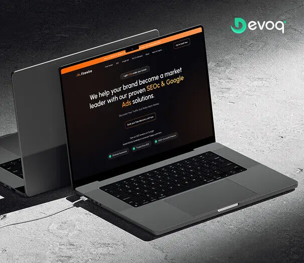
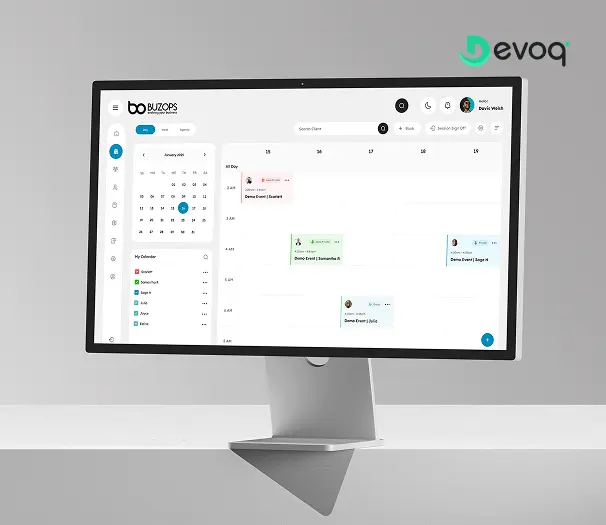
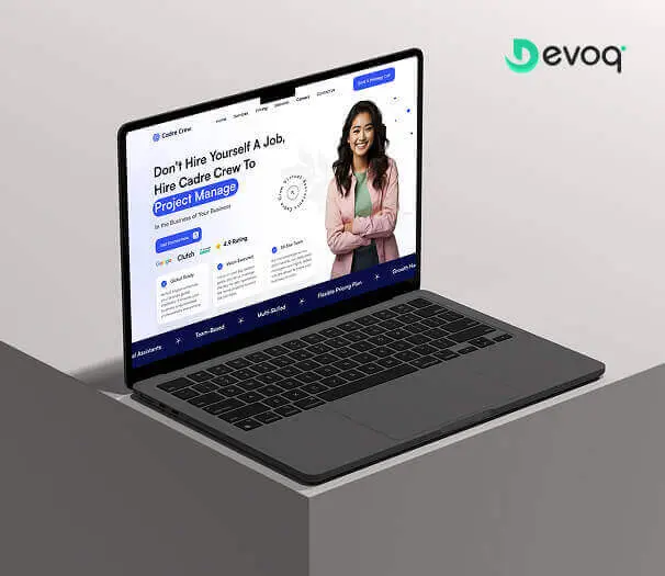
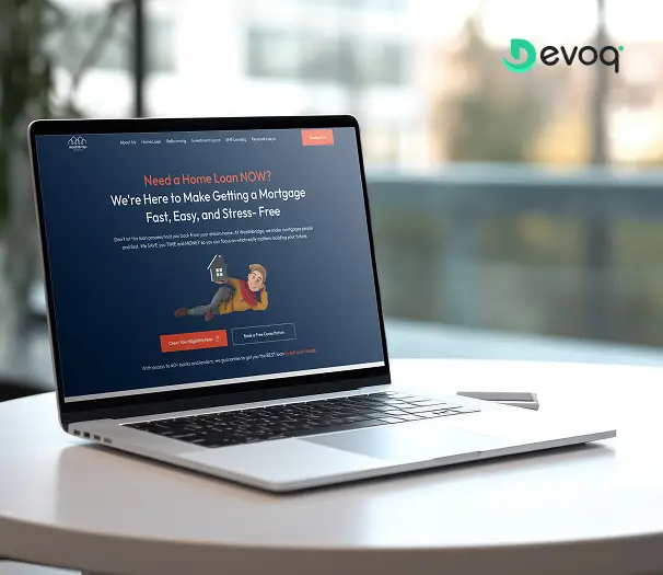
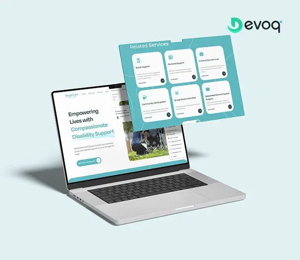
Real product work from the Devoq Design portfolio, including named studies such as Buzops, Firewire, Cadre Crew, Wealth Bridge and Angel Care.
Want the story behind an ops or SaaS case study?
We will walk you through console decisions, what changed in tables and workflows and how handoff worked with engineering, under NDA, with people close to the work. Buzops and related operational product work are natural conversation starters.
Your Dedicated TeamRoles you can staff beside a dashboard designer
Ops consoles usually need a dense-UI owner plus data and engineering partners. Roles below share engagement terms when you want a pod.
Dashboard Designer
Owns tables, filters, charts, empty/error states and RBAC views for the admin console.

Data / analytics partner
Defines metrics definitions so charts reflect trusted warehouse or product events.

Front-end Developer
Implements dense UI in code when design and build share one studio rhythm.

UX Researcher
Observes operator workflows when qualitative evidence must lead a major console redesign.

SaaS Product Designer
Separate lane when activation and end-user product journeys (not ops) own the pain.
QA partner
Checks filter combinations, export paths and permission-gated states before release.
What You ReceiveDeliverables at the end of every engagement
Handover is a defined stage of the work, not a negotiation at the end of it. Everything listed here transfers to you regardless of how the engagement concludes.

Working Figma files you own
Editable source for console modules and prototypes: transferred to your organization, not locked behind a vendor account.
Admin IA and module maps
Artefacts that explain how operational areas connect, so future teammates inherit console context, not only pretty frames.
Table, filter and RBAC specs
Documented patterns and states for the modules in scope, ready for eng to implement and extend to new entities.

Clickable prototype
A reviewable prototype of critical console paths with realistic density and data states that match what engineering is expected to build.
Annotated handoff notes
Behavior for filters, bulk actions and states documented so developers are not reverse-engineering intent from static screenshots.

Handover walkthrough
A recorded or live walkthrough for your ops and product team, plus a defined window for post-handoff clarification.
Expert AdviceBest practices when you hire a dashboard designer
Treat dashboard hiring as owning operator-grade information density and scan paths - not chart decoration.
Trial on a real module with production row counts
Give candidates a genuine table or reporting problem from your backlog. Evaluate how they handle filters, RBAC and data states, not only how a sparse portfolio mock photographs.
Separate console design from activation UX
If onboarding and feature adoption own the pain, brief a SaaS product designer. Do not starve ops console work by asking one person to redesign activation and rebuild every admin entity in the same month.
Settle staging access and sample data before kickoff
Agree which environments the designer may use, where Figma lives, and how realistic content gets into review, before anyone draws the first filter panel.
Invite eng and ops into console reviews early
Permission edges, query performance and bulk-action cost belong in week one. The designer who welcomes those constraints will out-ship the one who optimises only for the hero dashboard.
Weight operational communication as heavily as craft
In a distributed ops team, the designer who writes clear updates on filter decisions and open RBAC questions will beat a stronger stylist who disappears between reviews.
Things To KnowCommon mistakes to avoid
Five failure patterns we see when admin UI work arrives mid-flight, or after a release that made “hire saas admin dashboard designer” feel urgent for the wrong reasons.
Hiring a UI/UX generalist when density owns the brief
If tables, filters and RBAC presentation are the problem statement, do not brief a greenfield interface owner. Use the UI/UX lane when the product interface has no owner yet; use this lane when the console is live and ops friction leads.
Asking for consumer-style whitespace on ops screens
Sparse UI that looks elegant in a pitch often breaks under real data volume. Start with scanability and task completion; aesthetic minimalism can follow where it does not hide critical rows.
Treating activation UX as the whole SaaS brief
Onboarding matters: brief a SaaS product designer for it. Starving admin console craft while polishing first-run flows is how buyers keep paying support to do work the UI should enable.
Shipping tables without designed filter and empty states
If saved views and skeletons are improvisation, operators will keep exporting to spreadsheets. Budget console design for data states as part of the module, not as a hotfix after launch complaints.
Measuring the designer by screen count
Frame count is a vanity metric. Judge progress by modules clarified, filter rules specified and patterns eng could extend to new entities without guessing.
Support & MaintenanceWhat happens after the first console slice ships
Shipping a table or reporting redesign is when real operational usage starts producing information. Ongoing dashboard design support is structured around acting on that information.

Design QA on continuing releases
As engineering ships, we check new builds against the source of truth so small drifts do not become a second unofficial admin UI.
Pattern upkeep for new entities
When modules add net-new table or filter patterns, we fold survivors into the working set and retire one-offs that would otherwise fork the console look.
Ops-friction-driven iteration
Support tickets, workflow observation and operator feedback feed a prioritized design backlog for the next module to improve.
Flexible embedded capacity
Keep a designer part-time for steady console change, or surge for a new entity launch, without restarting vendor onboarding from zero.
Client FeedbackWhat clients say after working with us


“The client was pleased with Devoq Design’s thorough understanding of each design stage. They seamlessly integrated into the internal team, providing helpful critiques and insights. They regularly communicated via phone, email, and Slack. Devoq Design’s collaborative approach stood out.”
“Devoq Design has completed the design phase, and the client is very satisfied with the new layout. The service provider is responsive and incorporates the client's feedback. The client has been impressed with Devoq Design's ability to create both strategic and beautiful designs.”
“The project is still ongoing, but Devoq Design has already delivered functional components of the client's product. The team establishes a collaborative workflow through clear and constant communication, they always provide updates on the project's progress. They're also skilled at what they do.”
Frequently Asked QuestionsCommon questions about hiring dashboard designers
What does a dedicated dashboard designer at Devoq Design do?
A dedicated dashboard designer improves information-dense admin, analytics and internal SaaS consoles: tables, filters, saved views, chart and KPI composition, RBAC presentation, bulk actions and exports. At Devoq Design that person embeds with your product or ops owner and engineering (module reviews, filter behavior, design QA) so dense UI ships with intentional scanability rather than as a one-time sparse visual pass disconnected from how operators actually work.
How is this different from hiring a SaaS product designer?
SaaS product design owns activation, onboarding and feature adoption. This lane owns the console surfaces power users inhabit for hours: tables, filters, charts and permissions presentation. Same company often needs both; they are different briefs. Use SaaS product design when metrics-led journeys lead; use dashboard design when ops density leads.
How is this different from hiring a UI/UX designer?
UI/UX is the generalist interface owner when the product needs one accountable path. This lane assumes admin or analytics complexity is the problem: filter persistence, RBAC variants, bulk actions and data states at scale. UI/UX may touch a simple dashboard screen; this page is intentionally framed around data-density console craft.
Can you make complex tables usable without dumbing the product down?
That is the center of this engagement. We design column hierarchy, filters, saved views and progressive disclosure so power users scan and act efficiently, without removing the data ops teams need. Consumer-style whitespace that hides rows at production volume is not the default goal.
Do you design empty, loading and partial-data states?
Yes. Skeletons, empty states with next steps, error recovery and partial-fetch UI are specified as part of console modules, not left for engineering to invent after users assume the product is broken. Reliable data-state behavior is a core deliverable for admin surfaces.
How do you handle role-based views and permissions in the UI?
With view variants matched to permission levels. Visible actions, column sets and navigation entries differ for viewers, editors and admins so dangerous controls stay hidden without custom UI per customer. Backend RBAC must exist; our work presents it clearly.
Will you rebuild our entire product and brand?
Not by default. This hire evolves the console modules you already ship: continuing design language, respecting entity models and engineering constraints, and delivering iteration-ready slices. A total product reboot or activation program is a different lane, and often the wrong first move when ops tables are the pain.
How quickly can a dashboard designer join?
Join speed depends on seniority and your interview availability, not a fixed day-count on this page. After discovery we shortlist matched designers, run your interviews and validate with a trial sprint on a real admin module before you commit: ask for current capacity on the discovery call.
Who owns the Figma files and intellectual property?
You do. At Devoq Design, designs, prototypes and documentation are assigned to you contractually, with working Figma access transferred to your organization rather than locked in a vendor-only account. Ownership and transfer expectations are written at kickoff, not negotiated in an exit week.
What happens if the designer is not the right fit?
Dedicated engagements include a trial sprint before commitment and replacement cover within the first 30 days, with managed knowledge transfer so you do not restart from an empty file and a lost decision history on filter and table patterns.
How long does a typical dashboard design engagement take?
It depends on module count, data-model complexity and decision speed. A focused entity table, a reporting package, a multi-module console improvement and ongoing embedded design each sequence differently. We scope after discovery and revise at review boundaries rather than inventing week-count guarantees.
Do you provide support after the first handoff?
Yes. Ongoing work can include design QA on continuing releases, pattern upkeep for new entities, ops-friction-driven iteration and flexible embedded capacity when your console roadmap keeps changing after the first modules ship.
Related ServicesExplore other ways we can help
Dashboard designers sit beside SaaS product, generalist, Figma and mobile hires. These adjacent paths are the ones teams combine most often: each with a distinct center.
Hire SaaS Product Designer
When a live SaaS needs activation, onboarding and feature UX, not dense admin console craft as the primary brief.
Explore
Hire UI/UX Designer
When you need one interface owner across research through handoff, not data-density ops UI as the center.
Explore
Hire Figma Designer
When libraries, variables and Dev Mode hygiene (not table and filter strategy) are the bottleneck.
Explore
Hire Mobile App Designer
When iOS/Android platform conventions and store listing craft dominate, not desktop admin workstations.
ExploreUI/UX Design Services
Studio-wide product design delivery when you want an engagement framed as a service, not a hire seat.
Explore
Ready to hire a SaaS admin dashboard designer for your team?
Book a free consultation. We will scope the console modules, recommend an engagement model and share matched designer profiles. No obligation and no pressure script.