





















Responsive Web Design

We design and build websites that automatically adjust and look great, no matter what device someone is using a large computer screen, a tablet, or a small smartphone. Your content will always be clear, and your site easy to navigate, for all your visitors.
What We Serve

One Design That Works Everywhere Mobile, Tablet, Desktop

Users access your site from phones while commuting, tablets at home, and desktops at work. Most sites force them to suffer through a terrible experience on at least one device. Responsive web design means your site works beautifully on every screen size. It’s not a single design shrunk down it’s intelligently adapted. Navigation that makes sense on mobile. Content that’s readable on any device. Buttons that are clickable on touchscreens. Forms that work on tiny screens. Your users get a great experience whether they’re checking you out on a 5-inch phone or a 27-inch monitor. That consistency drives higher engagement, better conversion, and happier users across every device.
Our Approach

Flexible Layouts That Adapt Without Breaking

Fixed-width layouts break on different screens. Responsive layouts flow and adapt. We design flexible grids that expand and contract. We use proportional sizing instead of rigid pixels. We create breakpoints where content reorganizes for optimal viewing. We ensure images scale beautifully. We test at every breakpoint from the smallest phones to the largest monitors. Your site looks perfect everywhere because it’s designed to be flexible, not rigid.

What Is Responsive Web Design?

Product design is the process of creating digital solutions that solve real user problems while aligning with business goals. It combines user research, UX strategy, interface design, usability, and product thinking to build meaningful and scalable digital experiences.

Cross-Device Compatibility

Responsive websites work smoothly across mobile phones, tablets, laptops, and large desktop screens.

Better User Experience

Adaptive layouts improve readability, navigation, and usability on every device.

Improved Mobile Accessibility

Mobile-first responsive design ensures users can interact easily through touch-friendly experiences.

Higher Engagement & Conversions

Consistent experiences across devices improve engagement, retention, and customer actions.
At Devoq Design, our responsive web design services help businesses create scalable, fast, and user-friendly websites optimized for modern digital experiences.

Why Responsive Web Design Is Important

Modern users browse websites across multiple devices throughout the day. Businesses that fail to provide optimized cross-device experiences risk losing engagement, visibility, and conversions.

Better Mobile Experience

Responsive layouts improve usability across smartphones and tablets.

Improved SEO Performance

Search engines prioritize mobile-friendly and responsive websites.

Faster Website Performance

Optimized responsive websites improve speed and user satisfaction.

Increased Conversion Rates

Smooth cross-device experiences encourage users to take action.

Reduced Bounce Rates

Users stay engaged longer when websites function properly on every screen.

Future-Ready Scalability

Responsive websites adapt to future devices and screen resolutions easily.

Our Design Expertise

Device-Optimized Designs
We create responsive websites that provide a seamless experience across all devices.
Mobile-First Approach
Our designs prioritize mobile usability, ensuring optimal experiences on smartphones and tablets.
Faster Load Times
We optimize websites to load quickly across all devices, improving user satisfaction.
Scalable Solutions
Our responsive designs scale to accommodate future device releases and screen sizes.

Responsive Web Design Solutions We Offer

Every business has different user behaviors and device requirements. Our responsive web design solutions are tailored to your audience, industry, and business goals.

Responsive Website Design

Cross-device website experiences optimized for usability and performance.

Mobile-First Design


Design strategies focused on mobile usability and touch interactions.

Responsive Ecommerce Design

Optimized shopping experiences across all screen sizes and devices.

SaaS Platform Responsiveness

Scalable interfaces designed for complex SaaS workflows and dashboards.

Responsive UI Systems


Flexible interface systems that maintain consistency across devices.

Website Redesign Optimization

Transforming outdated websites into modern responsive experiences.
Our responsive web design services help businesses create fast, scalable, and conversion-focused digital experiences across all devices.

Customizable design process based on your needs.

Why Choose Us?

Universal Device Compatibility

 Your website will look and perform flawlessly on any screen size – phone, tablet, or desktop.

Seamless User Experience

Visitors get a consistent, high-quality experience regardless of how they access your site.

Optimized for All Screens

Content and layouts adapt beautifully to fit any display, ensuring readability and usability.

Future-Proof Layouts

 Designs are built to flex and adapt, staying relevant as new devices emerge.

Consistent Branding

Your brand’s visual identity remains strong and cohesive across all viewing environments.

Wider Audience Reach

 Connect with every potential customer, no matter their preferred Browse device.

Common Responsive Design Problems We Solve

Many websites struggle to provide smooth cross-device experiences due to outdated layouts, inconsistent interactions, and poor mobile optimization. Our responsive design process helps solve these usability challenges.

Poor Mobile Navigation

Heavy frontend code reduces loading speed and engagement.

Broken Layouts Across Devices

Interfaces fail to adapt properly across mobile devices and tablets.

Slow Mobile Performance

Websites behave inconsistently across browsers and platforms.

Inconsistent User Experience

Weak animations and interactions reduce user engagement.

Touch Interaction Issues

Designs break across different resolutions and screen sizes.

Low Mobile Conversions

Old frontend systems reduce scalability and maintainability.
Contact Us

Are you ready to look & feel the best version of your brand?

Technologies we work with

We speak tech fluently! Our team of thousands word engineers and designers is well-versed in a vast array of technologies. This allows us to craft the perfect solution for your needs, no matter the project’s complexity.

Figma

Sketch

Adobe XD

Adobe Photoshop

Adobe illustrator

Marvel App

Invision App

Zeplin

Framer

Protopie

Axure RP

Adobe After Effects

Webflow

Balsamiq

HTML & CSS

Bootstrap

JavaScript

Angular.JS

React JS

Npm

Typescript

Vue.Js

iOS

Android

Flutter

React Native

Xamarin

Kotlin

Swift App

PWA

WordPress

Elementor Pro

WooCommerce

Shopify

Magento

Joomla

Drupal

Wix

Big Commerce

MariaDB

MongoDB

Redis

MySQL

PostgreSQL

Oracle

Sqlite

AWS-RDS

Microsoft-Access

AWS

Azure

Google Cloud

Jenkins

Maven

Terraform

Kubernetes

Docker

What You’ll Receive

Our responsive web design deliverables provide scalable layouts, optimized user experiences, and development-ready responsive systems for successful digital products.

Responsive Website Layouts

Mobile-First UI Designs

Cross-Device UX Planning

Flexible Grid Systems

Responsive UI Components

Mobile Optimization Recommendations

Responsive Prototypes

Breakpoint Strategy Documentation

Developer Handoff Files

Product Optimization Guidelines

Every product design deliverable is customized based on your users, market goals, and business vision.

Our Passion: Your Growth, Our Recognition

At Devoq Design, client success is paramount. We measure our worth by the heights our clients reach. Awards are a delightful affirmation, but seeing your business flourish that’s the true reward.

30+ Reviews on Clutch

logo_clutch_dark
5.0

Design Company
by Clutch

Champion Company
by Clutch

Global Company
by Clutch

Top Rated
on Upwork

Best Company
by Goodfirms

Top Company
in Dribbble

Best Company
by Webflow

Top Company
in Behance

Top Companies Clutch Global

User Research Company
by Clutch

Digital Design Company
by Clutch
Discover Our Case Studies

Explore Compelling Case Studies: Real Solutions, Real Success Stories

Web UX/UI Design, Web Development

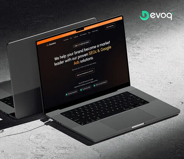
We crafted a sleek and intuitive website for Firewire, a leading digital marketing company, to showcase their expertise in simplifying financial transactions and empowering users to manage their finances with ease. Our design highlights their innovative approach to connecting businesses with their audience.
Revenues Grow
0 %
Increase Customer interaction
0 %
New Customer Acquisition
0 %

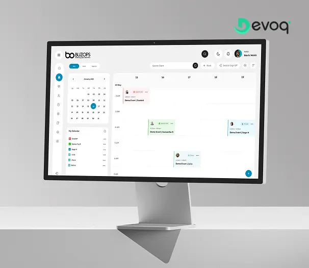
Web UX/UI Design, SaaS Platform

We created a clean and scalable SaaS experience for Buzops, helping businesses manage operations, automate workflows, and improve customer engagement through a unified platform.
Demo Request Increase
0 %
Platform Interaction Growth
0 %
Customer Acquisition Boost
0 %

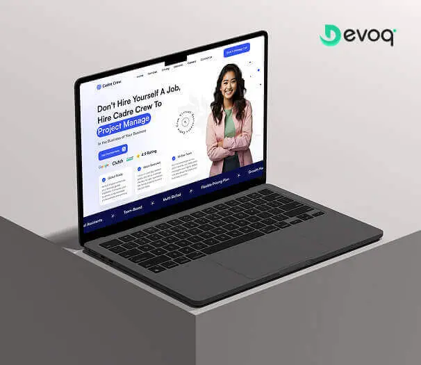
Web UX/UI Design, Web Development

We designed and developed a user-friendly website for Cadre Crew, a platform that simplifies financial transactions, bill payments, online purchases, and overall financial management. Our goal was to create an intuitive and efficient experience for their users.
Increase Customer Value
0 %
Boost Traffic
0 %
Higher Conversion Rate
0 %

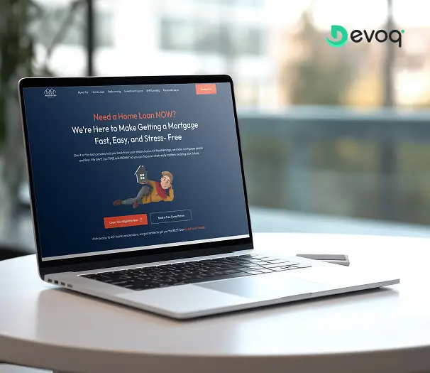
Web UX/UI Design, Web Development

We developed a modern and engaging online platform for Wealth Bridge, a firm specializing in financial advisory and investment solutions. The aim was to establish a credible and user-centric digital presence that simplifies complex financial information. With a focus on clarity, performance, and smooth user interaction, the website empowers clients to explore services, manage portfolios, and make informed financial decisions with confidence.
Higher Lead Generation
0 %
Growth in Page Interaction
0 %
More Returning Visitors
0 %

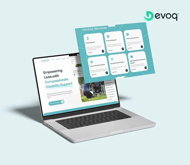
Web UX/UI Design, Healthcare Platform

We created a compassionate and accessible digital experience for AngelCare, simplifying care discovery, improving NDIS understanding, and empowering users to access personalized support services with ease.
Care Program Adoption
0 %
Client Interaction Increase
0 %
Satisfaction Score
0 %

While growth of our clients is what matters most, it`s nice to get awards

We unite Business-Driven + User-Centered UX process while creating the product design tocover business goals and user`s needs.
img_reviews_06
Michael Cosgrove
Oct 3, 2023
Devoq Design’s work helped improve user satisfaction, reduce bounce rates, and increase conversion rates and positive feedback. The team consistently met deadlines and adapted well to evolving project requirements. Overall, they were responsive, experienced, and communicative.
img_reviews_02
Emin Salmanov
Mar 10, 2024
The client was pleased with Devoq Design’s thorough understanding of each design stage. They seamlessly integrated into the internal team, providing helpful critiques and insights. They regularly communicated via phone, email, and Slack. Devoq Design’s collaborative approach stood out.
img_reviews_07
Johan Timmer
Mar 1, 2024
Devoq Design delivered a visually stunning website, improving the client's online presence and traffic. The team was attentive to detail and communicated effectively through emails and messages. Moreover, their professionalism, innovative work, and personalized approach were also outstanding.
img_reviews_03
Erin Gouse
May 14, 2019
Devoq Design Studio offered detailed documentation and maintained open lines of communication throughout the project. Their proactive approach set them apart from other vendors.
img_reviews_05
Anika Schleifer
Mar 21, 2024
Devoq Design has completed the design phase, and the client is very satisfied with the new layout. The service provider is responsive and incorporates the client's feedback. The client has been impressed with Devoq Design's ability to create both strategic and beautiful designs.
img_reviews_08
Tom Peeters
Mar 12, 2024
The project is still ongoing, but Devoq Design has already delivered functional components of the client's product. The team establishes a collaborative workflow through clear and constant communication — they always provide updates on the project's progress. They're also skilled at what they do.

Frequently Asked Questions

What is responsive web design?
Responsive web design is an approach that enables a website to automatically adapt its layout, images, and content to different screen sizes, providing an optimal experience on desktops, tablets, and smartphones.
Why is responsive design important?
Responsive design ensures your website is accessible and easy to use on all devices, improving usability, customer satisfaction, and overall website performance while supporting modern browsing habits.
What is mobile-first design?
Mobile-first design is a development approach that starts by designing for smaller screens first and then progressively enhances the experience for larger devices, ensuring optimal performance on mobile devices.
How does responsive design improve SEO?
Responsive design improves SEO by enhancing mobile usability, page speed, Core Web Vitals, and user experience, helping search engines rank your website more effectively.
How long does responsive web design take?
The timeline depends on the size and complexity of the website. Smaller websites may take a few weeks, while larger websites or web applications can take several weeks or months.
What devices should responsive websites support?
Responsive websites should support desktops, laptops, tablets, smartphones, and a wide range of screen sizes and browsers to provide a consistent user experience.
Can responsive design improve conversions?
Yes. A responsive website makes it easier for users to navigate, interact, and complete actions on any device, leading to higher engagement, improved customer satisfaction, and increased conversions.
What is the difference between responsive and adaptive design?
Responsive design uses flexible layouts that automatically adjust to different screen sizes, while adaptive design uses predefined layouts designed for specific devices or screen widths.
Why hire a responsive web design agency?
A responsive web design agency creates fast, mobile-friendly, and accessible websites that deliver consistent experiences across devices while improving performance, SEO, and user engagement.
How does responsive design improve user experience?
Responsive design enhances user experience by providing intuitive navigation, readable content, optimized images, and seamless interactions across all devices, ensuring users can easily access your website wherever they are.

Get In touch

Please fill in the form below.

    We’re Here!

    India

    111, Platinum Plaza Opp. I.O.C. petrol pump, Bodakdev, Ahmedabad - 380054

    Canada

    23 Mullen Drive Ajax, L1T2A9 Ontario, Canada

    US

    2108 N ST STE N SACRAMENTO, CA 95816

    Follow us

    Contact Us

    Have a project in mind? Let's get to chat