Buzops
Buzops is a gym-management platform. The case study frames it as software that puts class scheduling, member payments, attendance, messaging and analytics in one place so owners and staff are not jumping between tools to run the day.
The page is dated 2024 and is deliberately visual: About, Problem & Solution, User Persona, typography, color, components, grid, design process, and Results & Impact are carried by designed screens and diagrams. This section puts those screens into words so crawlers and readers get the same story.
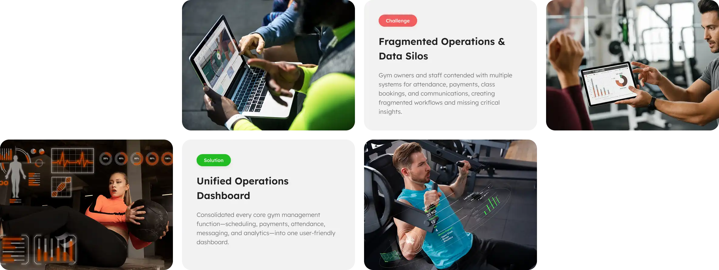
The Problem & Solution board states the challenge as fragmented operations and data silos: gym owners and staff were using separate systems for attendance, payments, class bookings and communications, which broke workflows and hid useful insight.
The solution board answers with a unified operations dashboard — consolidating scheduling, payments, attendance, messaging and analytics into one interface meant to stay usable under day-to-day gym operations.
Two personas appear on the page:
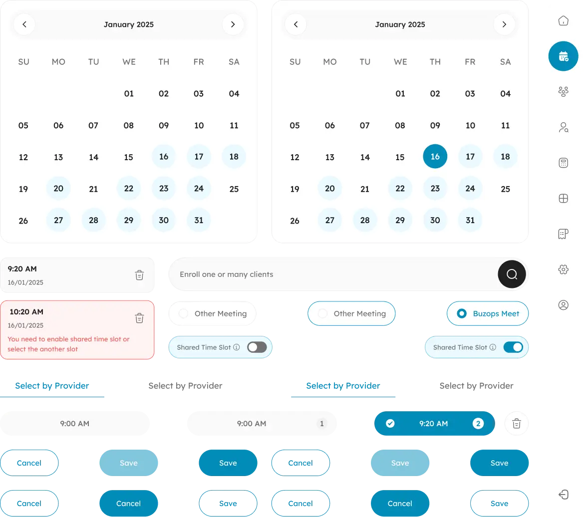
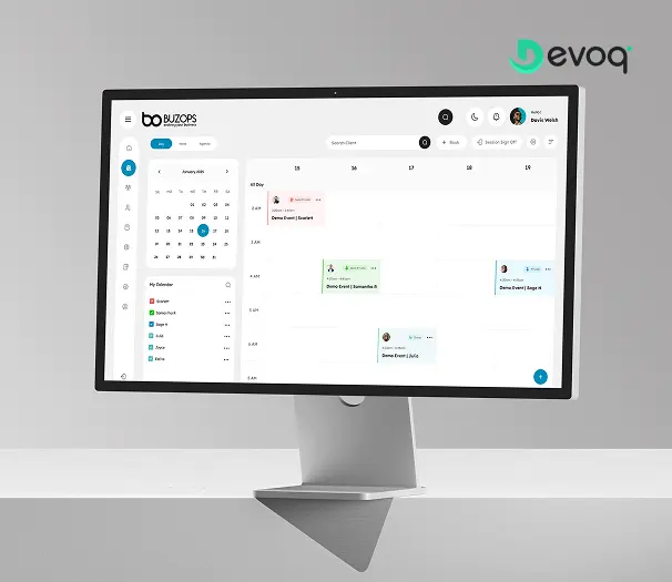
The featured desktop screen is a multi-staff calendar: mini month picker, color-coded coach filters, a weekly grid of sessions, search for clients, and a primary + Book action. Component boards zoom into the booking micro-flow — month calendars with selected dates, appointment cards with delete actions, conflict messaging when a shared time slot is not enabled, toggles for shared slots, meeting-type choices (including Buzops Meet), time-slot chips, provider filters, and Save / Cancel states. A slim icon sidebar keeps Calendar as the active destination among home, people, profile and settings.
Across the challenge/solution photography and the persona goals, payments sit beside attendance and communications as a core job: billing automation, overdue payment visibility, and client enrollment search (“Enroll one or many clients”) rather than a separate finance tool. The product framing is operational — get money and membership status out of siloed apps and into the same dashboard as the schedule.
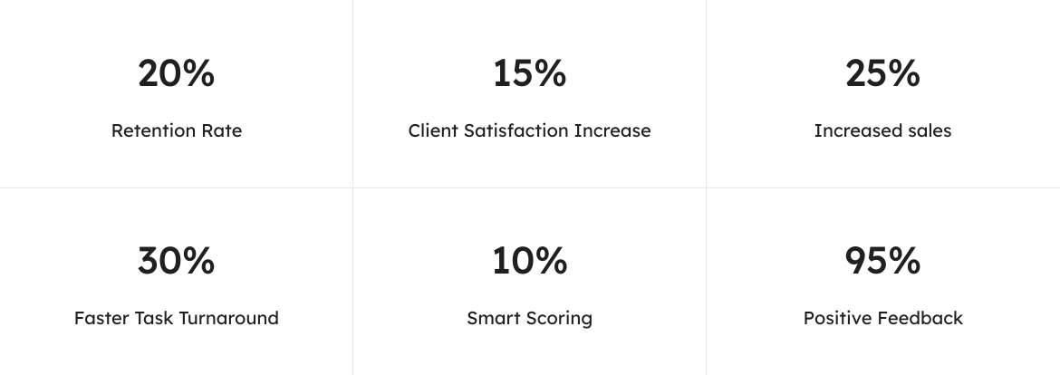
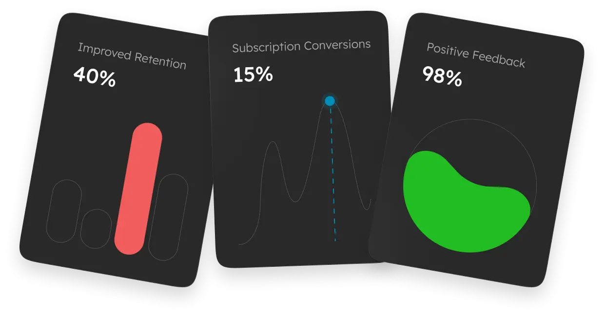
Analytics show up as staff-facing dashboards on tablet and desktop: bar charts, donut charts and dense summary panels for owners reviewing performance. Workout-adjacent frames layer progress gauges, trend lines and session stats over training photography — visual language for “see what is happening” rather than exporting another spreadsheet. The Results & Impact strip presents three designed metric cards (retention, subscription conversions, positive feedback) with chart treatments; sitewide outcome counters for Buzops are maintained separately in the metrics data file.
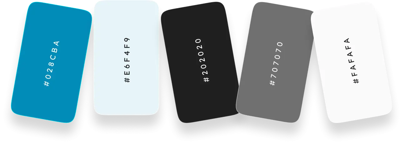
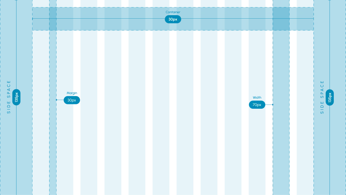
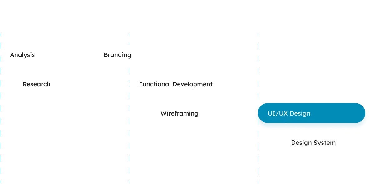
Between the product story and the results frames, the page documents Lexend typography, a color board, UI components, a grid system and a design-process diagram — the craft layer that keeps the scheduling, payments and analytics screens coherent.
See more engagements in Case Studies, or reach Devoq Design via Contact Us.