
Skip to content

Case study

Minxpay

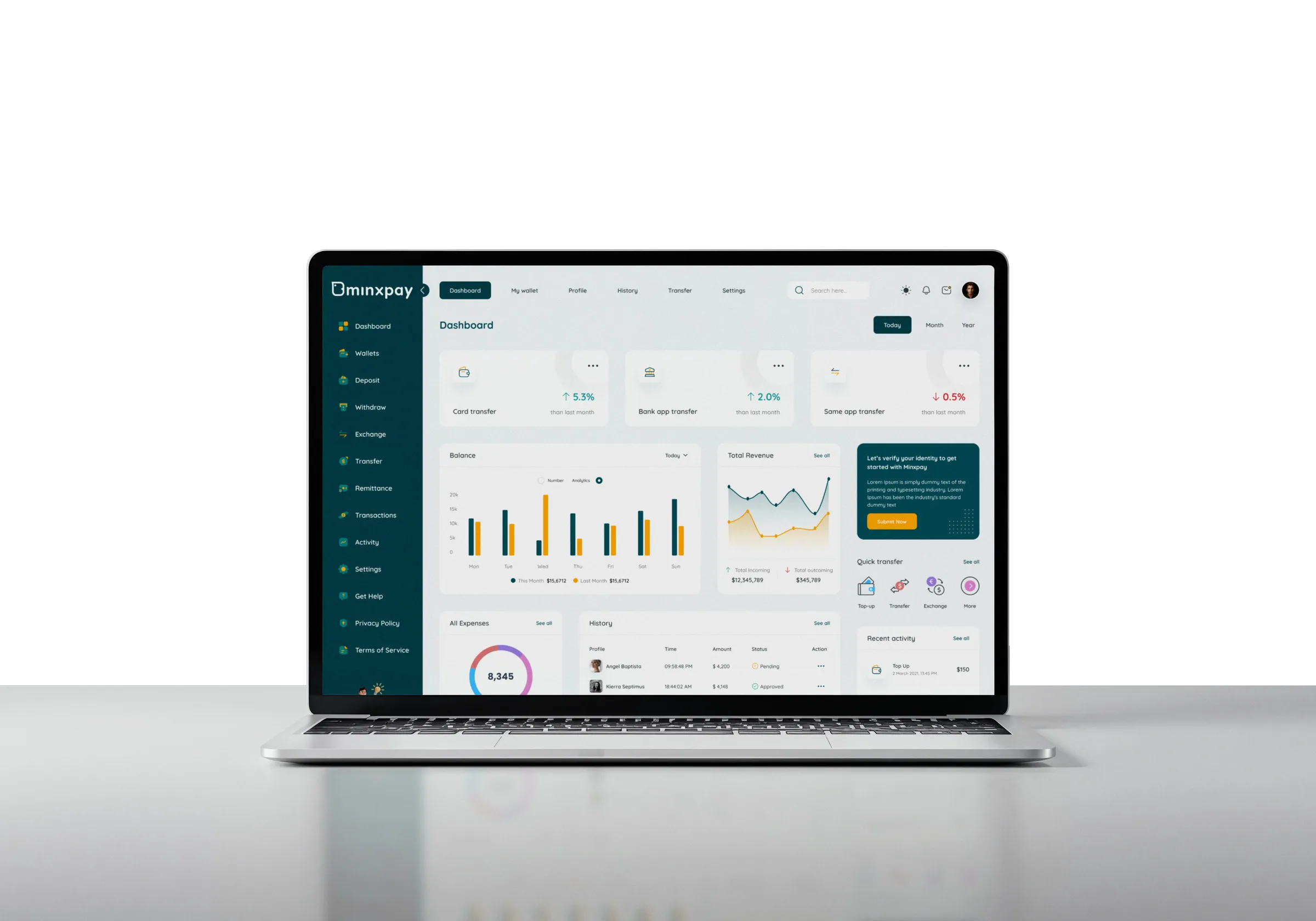
The Minxpay web dashboard open on a laptop

A digital wallet for Singapore, with a mobile app for customers and a web dashboard for the operations team.


Overview

90Screens

Minxpay is a digital wallet for Singapore, with a mobile app for customers and a web dashboard for the operations team, covering balances, top-ups, currency exchange, withdrawals, and linked bank accounts.

This case study covers 45 desktop screens, each with its own mobile companion: onboarding and identity verification, the live transaction dashboard, top-up and payment methods, withdrawals with an audit-ready review step, an ATM locator, and account settings.

Client

A digital wallet built for the Singapore market.

The client's internal figures are confidential. Everything shown here is the design work itself.

Client
Erin R
Industry
Digital wallet & payments
Market
Singapore · SGD and USD wallets, PayNow
Scope
UI/UX design, web dashboard + mobile
Deliverables
Component library, 45 desktop + 45 mobile screens, prototype, dev handoff
Timeline
2025–2026

Process

How it was built.

  1. Research
  2. Wireframing
  3. Design
  4. Prototyping
  5. Responsive
  6. Design Handoff

Problem

Verification, repeated questions, and scattered flows stood between users and their money.

  • Verification felt like a wall, not a step.

    Fifteen of Minxpay's screens are dedicated to onboarding and identity (sign-up, agreement, email/phone verification, passcode setup), and that matters: poorly sequenced KYC flows lose a large share of users before they finish.

  • The same question got asked five different ways.

    Top-up, withdrawal, and bank linking each needed their own identity check, and a generic "enter code" screen repeated with no visual or behavioral consistency trains no one; it just adds friction every time.

  • Money movement was scattered across a dozen disconnected screens.

    A single top-up touches method selection, currency choice, verification, and a result state: four decisions that needed to feel like one continuous action, not four page loads.

  • Withdrawals had to feel instant and stay auditable.

    Users want their money now; compliance needs a record of exactly what moved, from where, to where. Those two needs usually fight each other in the UI.

User persona

Two people use Minxpay: one moves money, the other approves it.

Mikey Smith, the customer persona who moves money with Minxpay
Mikey Smith

Goals

  • Top up in SGD or USD without paying a fee on every transfer
  • Move money to a linked DBS or Standard Chartered account the same day
  • Confirm a transfer landed without hunting for a receipt

Frustrations

  • Re-entering an OTP for every action, even a $40 top-up
  • Losing track of which wallet a balance actually sits in
  • Not knowing whether a failed top-up still took the money

James Mark, the operations persona who approves transfers in Minxpay
James Mark

Goals

  • Approve or flag every pending transfer before end of day
  • Spot a swing in card vs bank vs same-app transfer at a glance
  • See exactly where a withdrawal is going before approving it

Frustrations

  • A transaction table that shows status but not who initiated it
  • Leaving the review to go check a balance on another screen
  • Manual KYC re-checks that stall a payout for hours

Goals

Four targets shaped every screen in Minxpay's money-movement flow.

  1. Give every identity check (sign-up, top-up, withdrawal, bank linking) a consistent visual shell, so users learn the pattern once instead of relearning it five times.

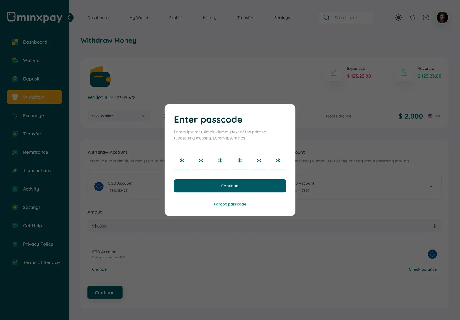
  2. Default to biometric/passcode verification for in-app transactions and reserve OTP for account-level changes, matching where each method actually performs better.

  3. Keep balance, amount, and account context visible through every step of top-up and withdrawal, instead of losing it behind page navigations.

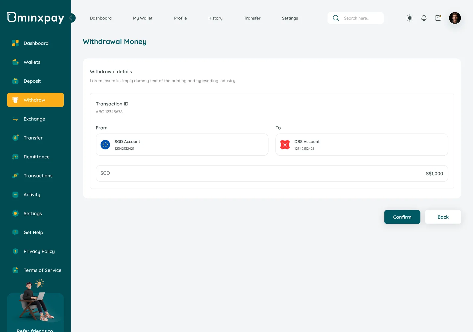
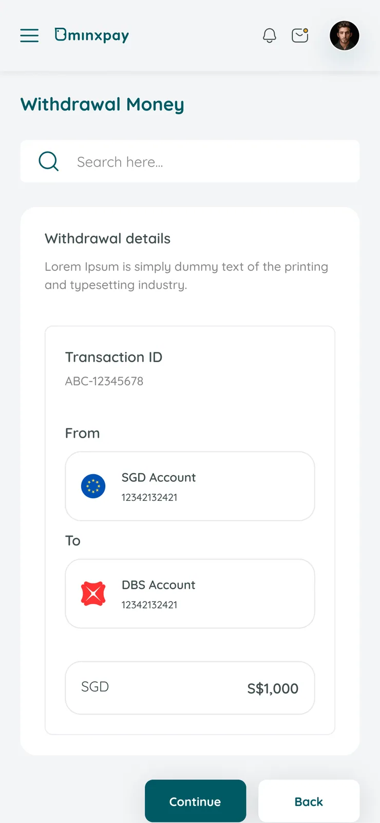
  4. Make the withdrawal review screen legible enough to double as a receipt: Transaction ID and From/To visible before the user even confirms.

Research

Fintech UX patterns shaped where Minxpay spends its friction budget.

  • Speed

    Long KYC flows lose people; keep identity steps short and resumable.

  • Re-uploads

    Re-upload requests drive abandonment; get capture right first time.

  • OTP friction

    PIN and OTP friction stalls transactions; ask only when risk demands it.

  • Biometrics

    Biometric confirmation completes more smoothly than OTP; make it the default.

  • Currency choice

    People prefer picking their currency over auto-switching; keep it in their hands.

  • Payout delays

    Manual KYC re-checks at withdrawal delay payouts; verify once, up front.

Primary flow

Top-up is Minxpay's highest-traffic action: the flow the whole verification pattern is built around.

Minxpay user flow diagram: onboarding and sign-in lead to the dashboard, which branches into top-up, exchange, withdraw, remittance and refer-and-earn flows, each ending in a verification step and a result stateOnboardingMinxpaySign InSign upSet PasscodeDashboardRemittanceRefer and EarnExchangeTop-upWithdrawTop-up MethodsSelect BankLinked Bank AccountsCardsOtherBank TransferPaynowAdd CardsBank PermissionChoose a CurrencyEnter passcodeVerifyEdit BankRemove BankWithdraw MoneyAdd RecipientRemove recipientTransfer OverseasTop-upReview TransferTransaction VerifyTransaction VerifyTop-up SuccessfulReview Transfer SuccessfulTransfer CompletedRecipient DetailsATMs LocationView ChartReview (Exchange)Transaction VerifyExchange SuccessfullyMobile VerifyEmail Verify2FAReview withdrawalsTransaction VerifyWithdrawal SuccessChange Bank AccountEdit CardWarning Popup Yes / NoBank / Cards RemovedCopied Link Send IndividualChoose ContactsShare Invitation LinkInvite successfullyAdd Account / CardsBank Account / Card SuccessfullyVerification FailedForget PasswordEnter Email / MobileVerification CodeNew PasswordPassword UpdatedVerify OTPSet PasscodeTop-up successfulWalletAdd BankWithdrawal SummaryUserYesNo

Grid system

One 12-column grid on desktop, four on mobile.

Every desktop screen sits on a 12-column grid with a 24px gutter and an 80px outer margin; the mobile companion collapses to 4 columns with 16px gutters. Spacing steps in multiples of 4 so a card, a table row and a modal all land on the same rhythm.

Components

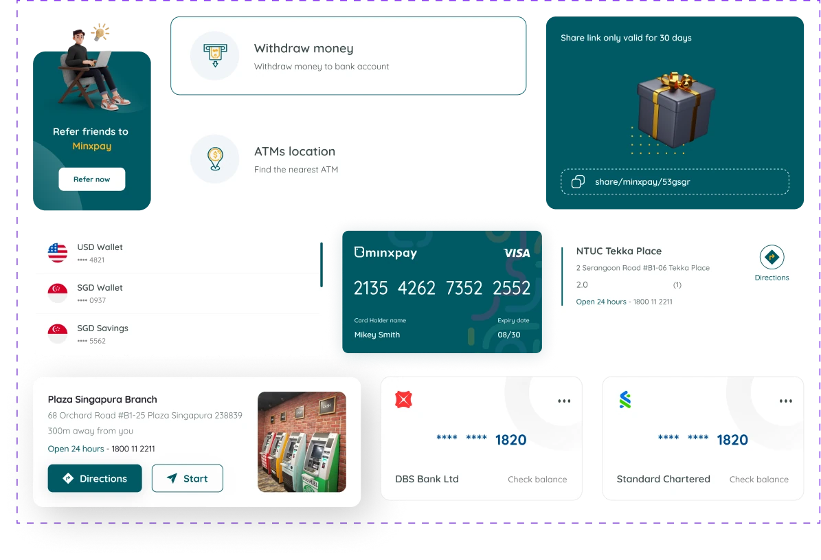
The atoms every Minxpay screen is assembled from.

Minxpay component library: referral card, action rows, wallet list, payment card, ATM location cards and linked bank account cards

Feature 01

Onboarding & Auth

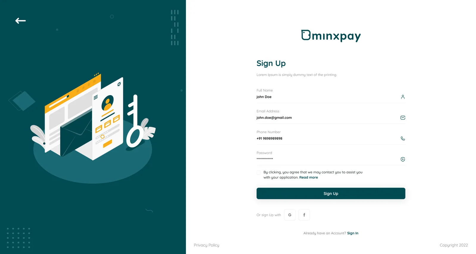
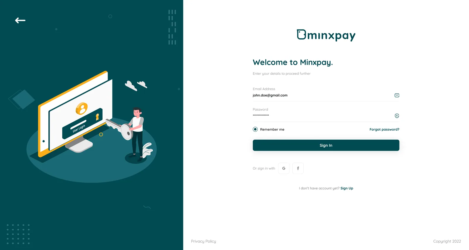
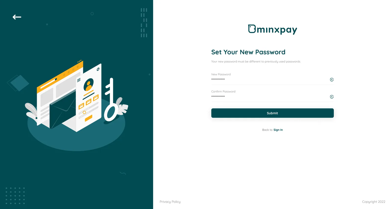
New users arrive from several entry points (email, phone, social) and need to trust a wallet before they'll trust it with money. Minxpay splits Sign In, Sign Up, and password recovery into single-purpose screens instead of one long form, and gives legal consent (Agreement) its own step in plain language rather than a checkbox buried at the bottom of a long form. Each screen asks exactly one thing, so a user always knows what happens when they tap the button.

Minxpay sign-up screenMinxpay sign-in screen with the Welcome to Minxpay formMinxpay account access screen

Feature 02

Verification & Security

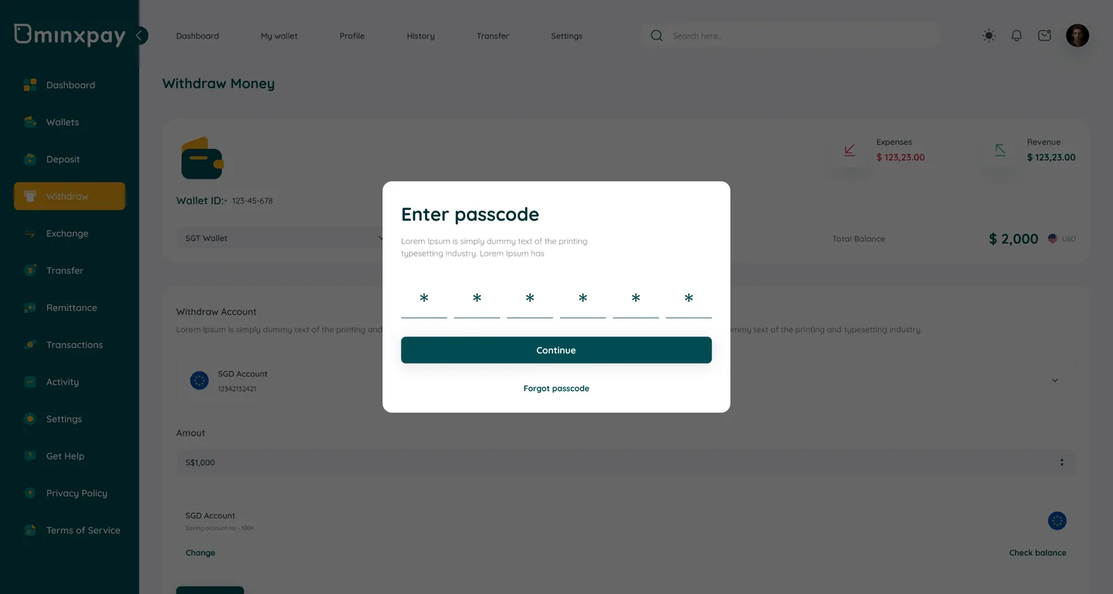
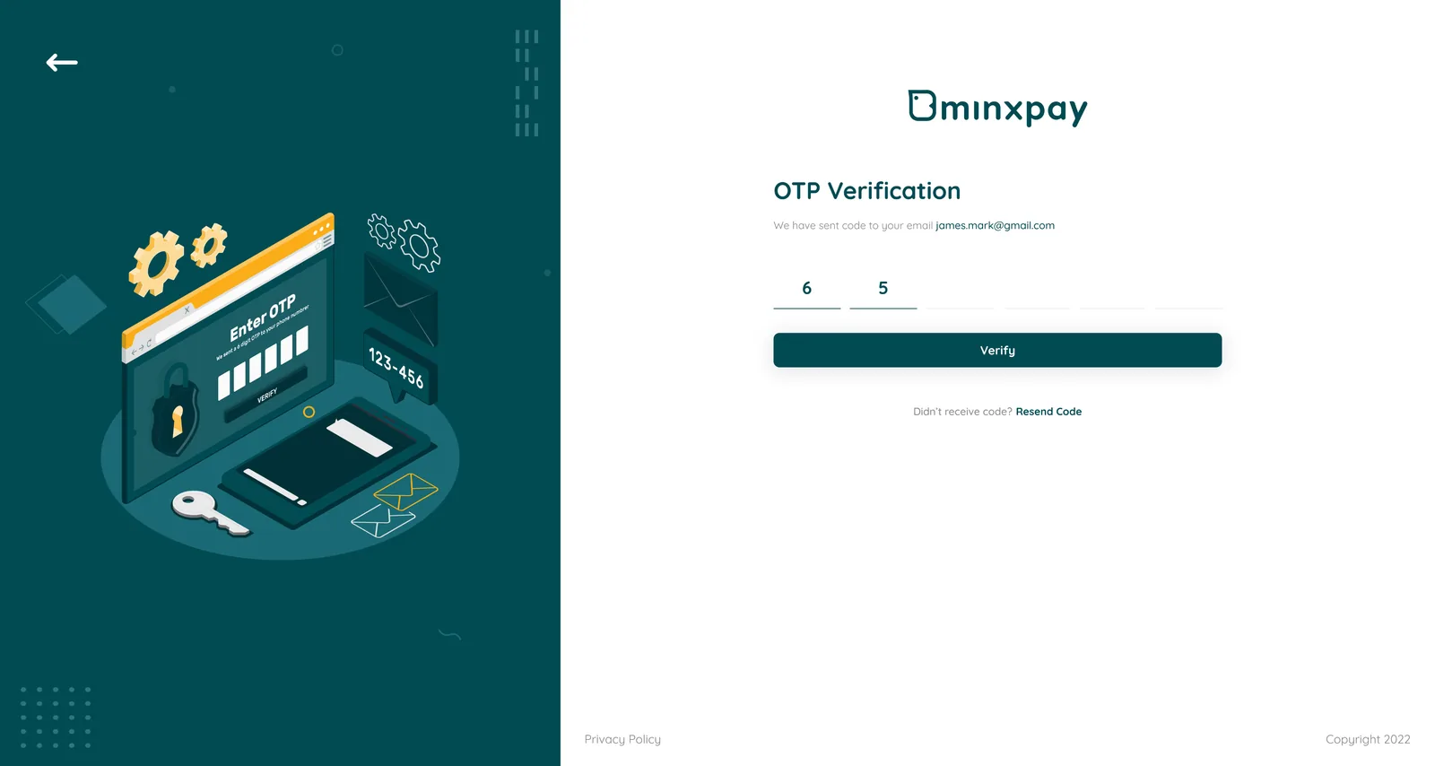
Minxpay asks for identity verification more than once: at sign-up, and again at every sensitive action. Rather than reusing one generic "enter code" screen everywhere, Minxpay gives verification a consistent shell and makes passcode/Face ID the default for in-app transactions, keeping OTP for account-level changes. That split reserves the highest-friction method for the moments that actually need it.

Minxpay Enter passcode overlay on the withdraw screenMinxpay OTP verification screen

Feature 03

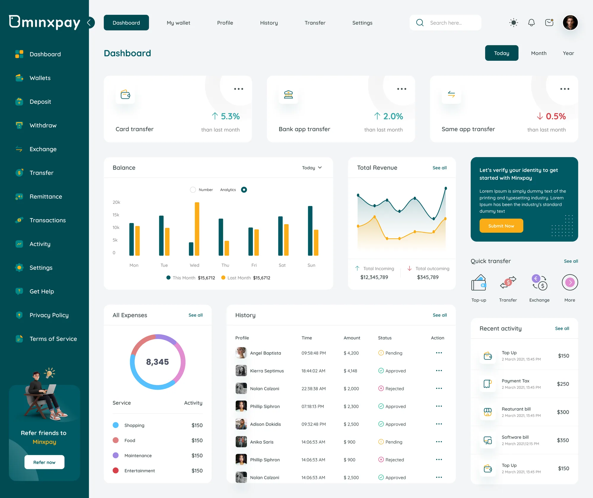
Dashboard & Analytics

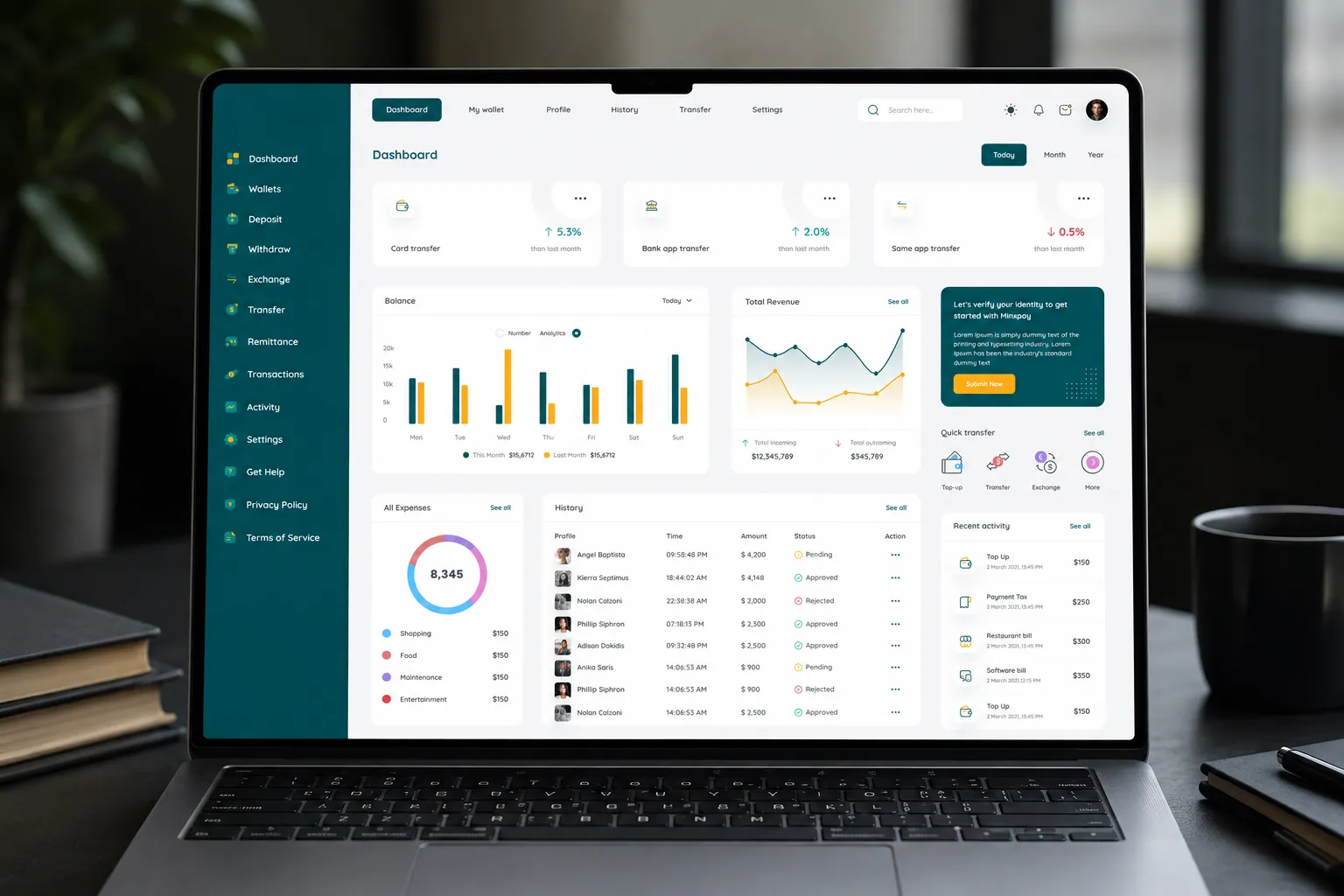
The dashboard is the first and most-returned-to screen, and it has to answer three questions at a glance: is my money moving normally, where did it go, and what needs my attention. Minxpay leads with three trend cards (Card transfer, Bank app transfer, Same app transfer, each with a week-over-week percentage) above a weekly bar chart, then pushes the full transaction table below. A KYC nudge sits as an inline banner, not a blocking modal.

Minxpay dashboard with transfer trend cards, weekly balance chart, revenue chart and transaction history

Click map

Where admins are designed to click.

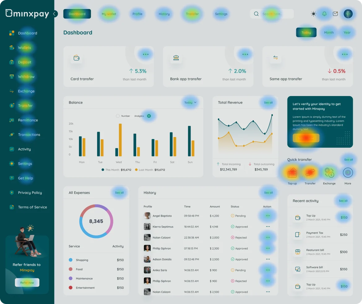
A design-intent click map of the dashboard: heat sits only on interactive targets (buttons, tabs, links, menus), weighted by how central each action is to an admin's day. It maps layout decisions, not recorded sessions.

Design-intent click map over the Minxpay dashboard, with the strongest heat on the Submit Now button and the Quick transfer row
  1. 01Submit Now carries the hottest spot

    It is the only filled button on the page, so an unverified admin's first click goes to identity verification.

  2. 02Top-up and Transfer lead Quick transfer

    The two highest-traffic money actions sit first in the row; Exchange and More take the overflow.

  3. 03Sidebar keeps every section one click away

    Dashboard, Transfer and Settings stay pinned in the sidebar on every screen, so admins can jump between sections without losing their place.

  4. 04Date filters get steady use

    Today / Month / Year is the main way admins re-read the KPI cards, so it stays warm all session.

  5. 05Row actions and See all stay secondary

    History menus, See all links and Refer now catch occasional clicks without pulling focus from money movement.

Design-intent map, not recorded data.

Feature 04

Top-up & Payments

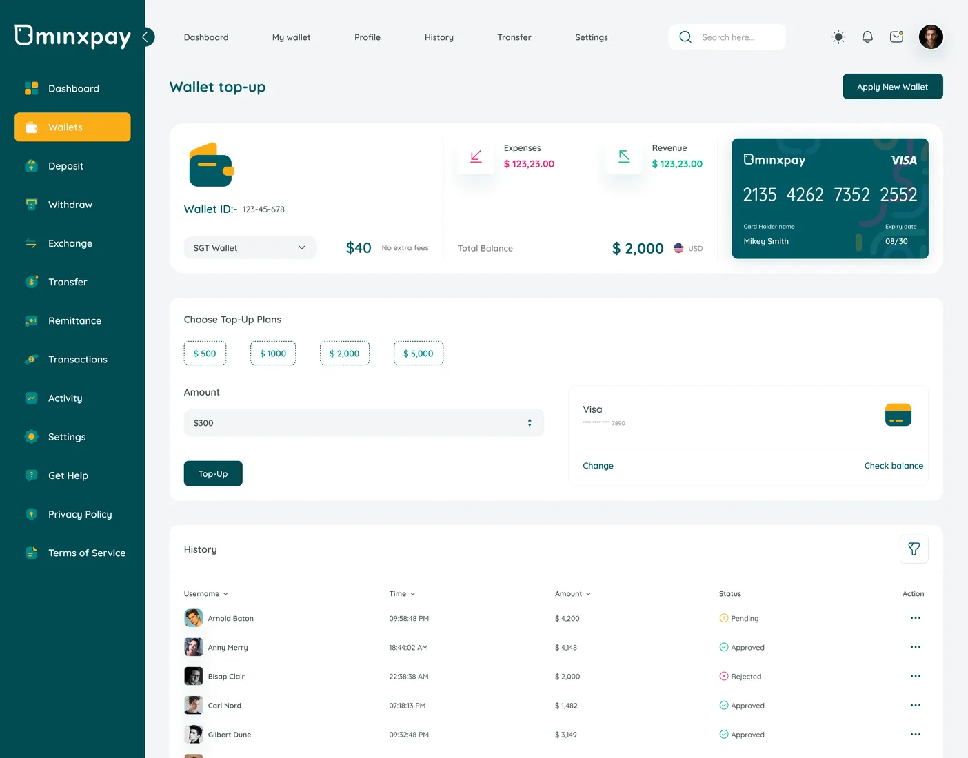
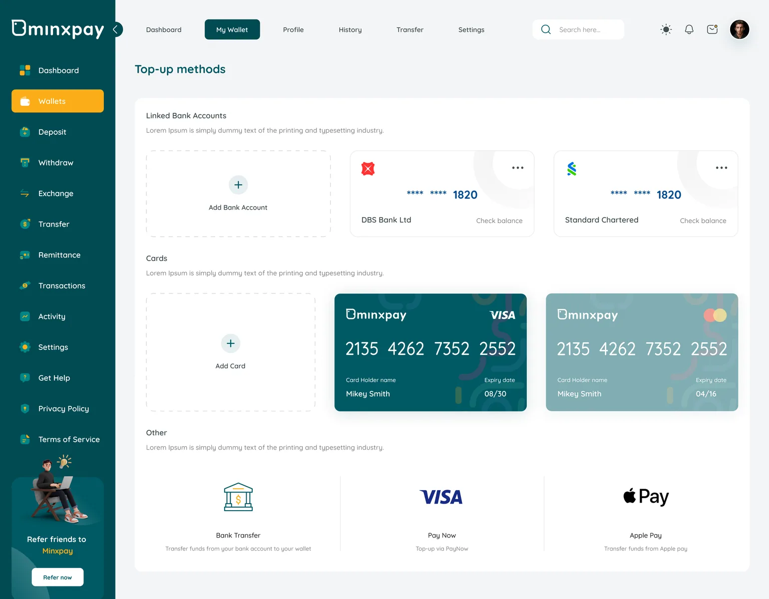
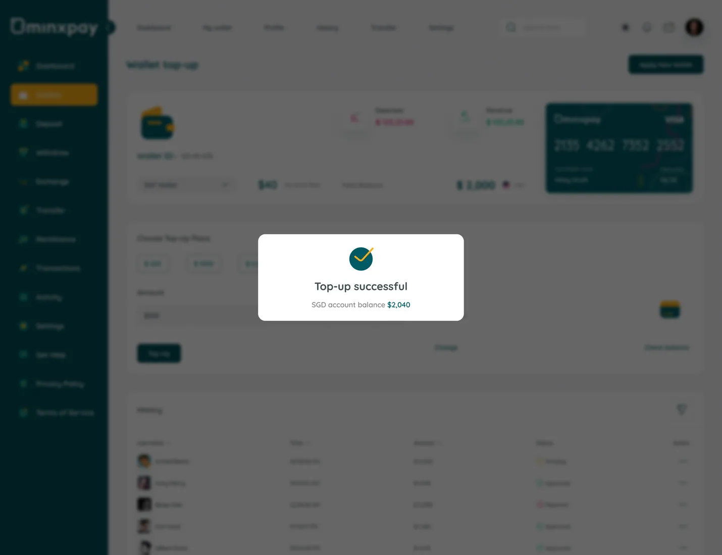
Topping up is Minxpay's highest-traffic action, and the source flow shows why it needed the most screens: method (card, Apple Pay, PayNow, bank transfer), currency/wallet, verification, then a result state. Minxpay keeps the base Top-up screen persistent underneath every choice (currency picker, Apple Pay sheet, verification) as an overlay rather than a page change, so the running balance and preset amount ($40, "No extra fees") stay visible through the whole decision.

Minxpay wallet top-up screen with balance and preset amountsMinxpay top-up methods: linked bank accounts, cards, bank transfer, PayNow and Apple PayMinxpay top-up successful confirmation overlay

Feature 05

Withdrawals

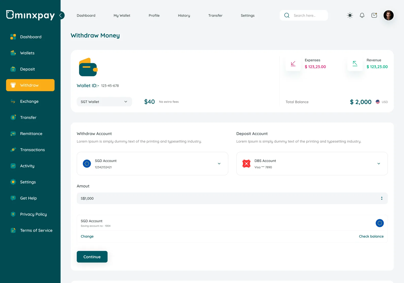
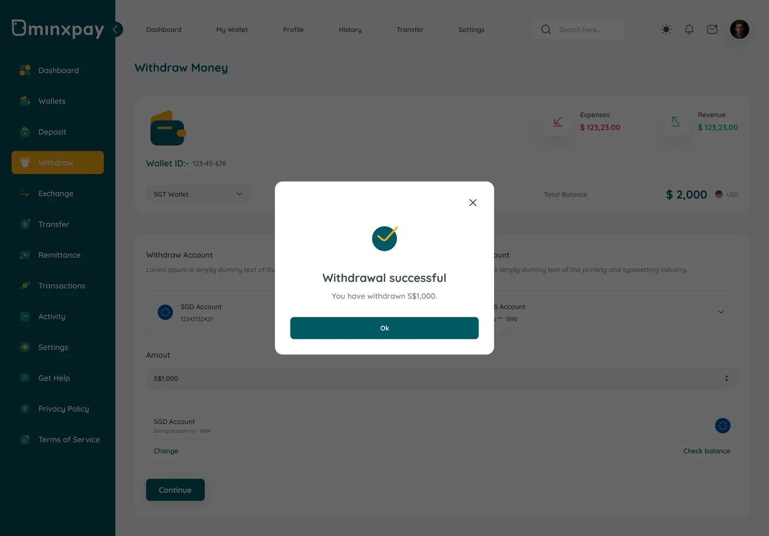
Withdrawals are where trust and compliance meet: the user wants their money now, and the system needs a record. Minxpay builds a four-step spine so the review screen doubles as a receipt a user could screenshot, not just a confirmation dialog. A separate Completed Summary repeats the same Transaction ID and From/To pair afterward, closing the loop.

Minxpay withdraw money screen: choose accounts and amountMinxpay withdrawal review showing Transaction ID and From/To accountsMinxpay passcode entry overlay during a withdrawalMinxpay withdrawal successful confirmation

Feature 06

ATM Locator

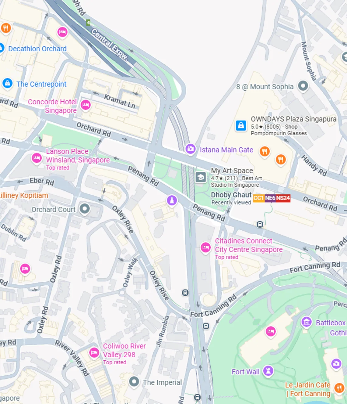
Not every withdrawal happens inside the app. The ATM Locator answers "where's the nearest one" with real-world specificity (distance, address, hours, rating) for actual Singapore locations like Plaza Singapura and Dhoby Ghaut MRT, rather than a generic pin-drop. Distance and open-status sit directly on each list item, so comparing options happens on the list, not after tapping in.

  • Each result lists distance, full address, and hours together, so the choice of which ATM to visit happens on the list.
  • Real named locations, not placeholder pins, make the locator read as trustworthy and local.
  • Directions is one tap from the list, keeping the locator a lookup tool, not a separate mini-app.
Minxpay ATM locator map of central Singapore

Feature 07

Account & Settings

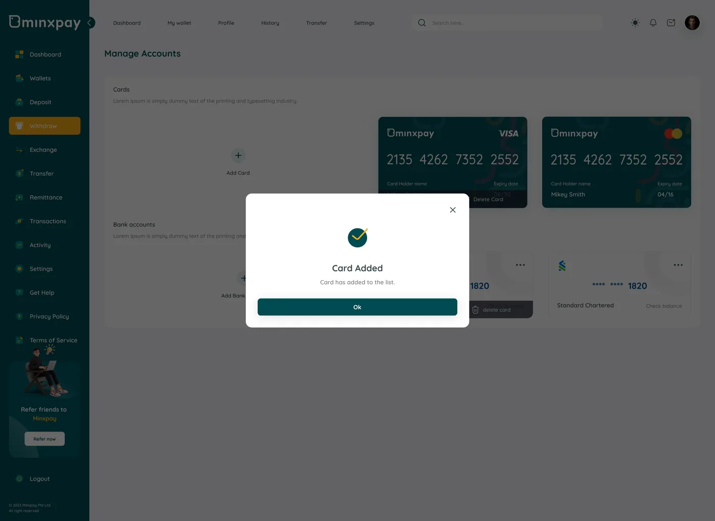
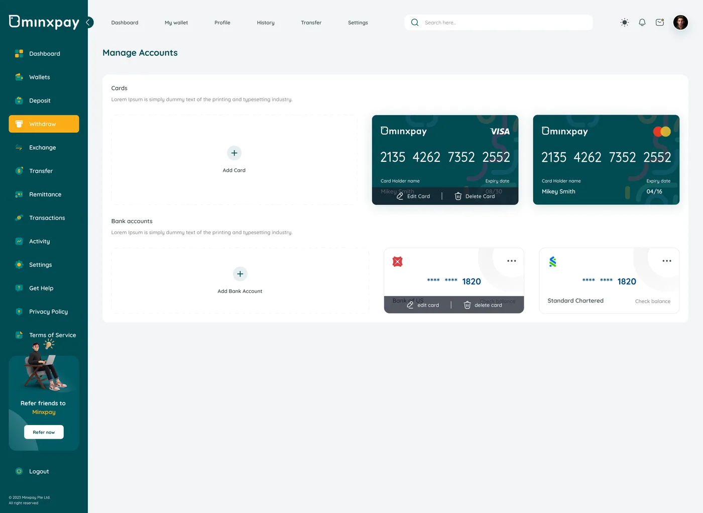
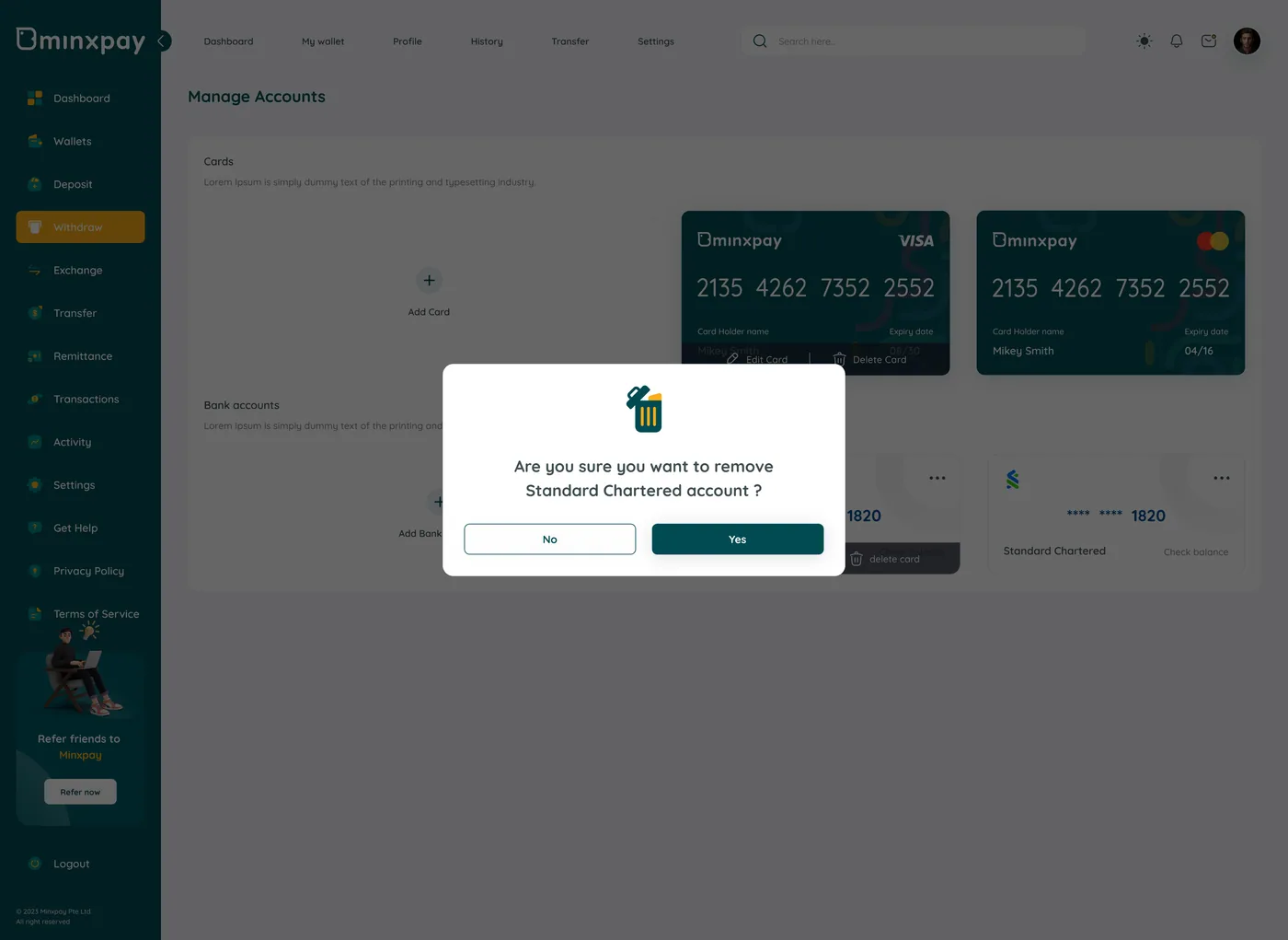
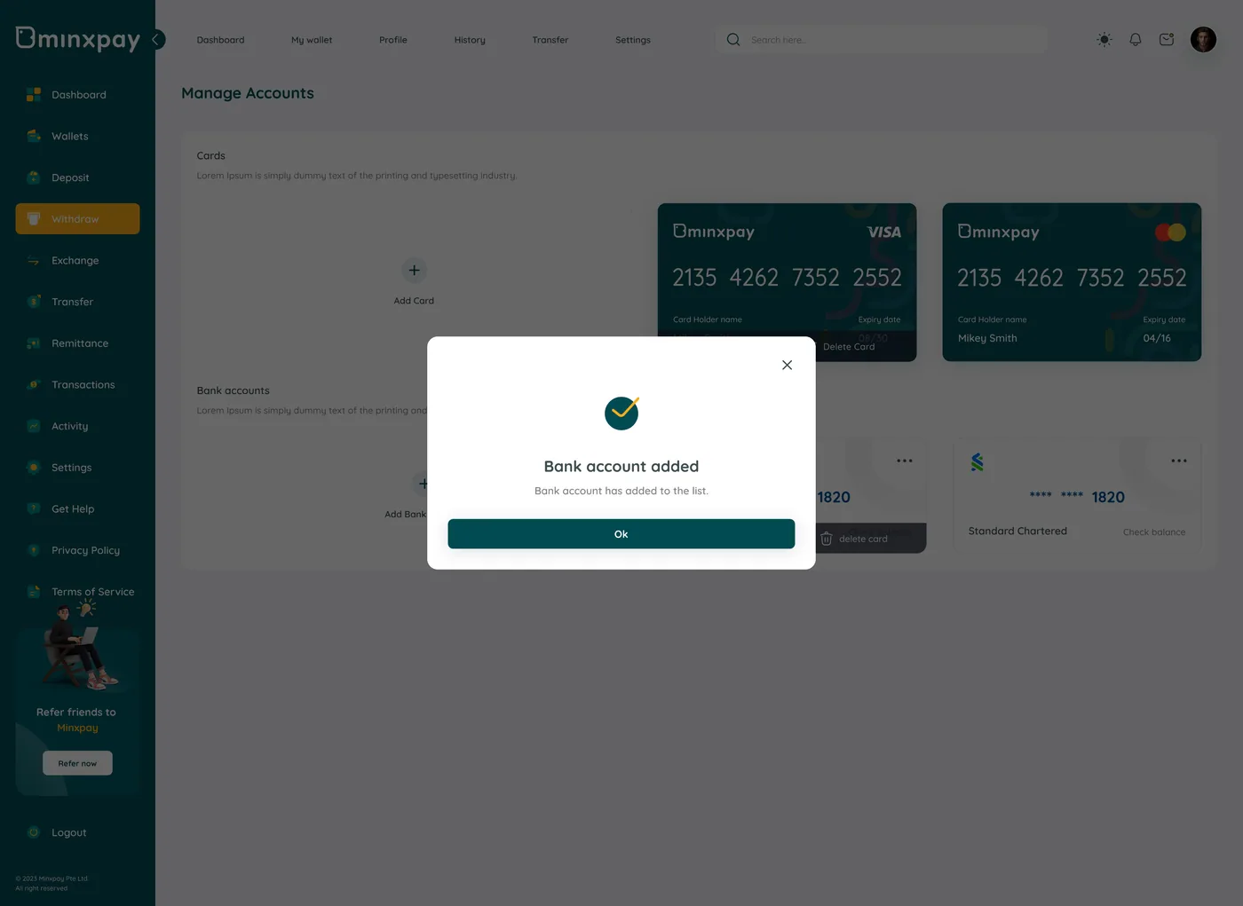
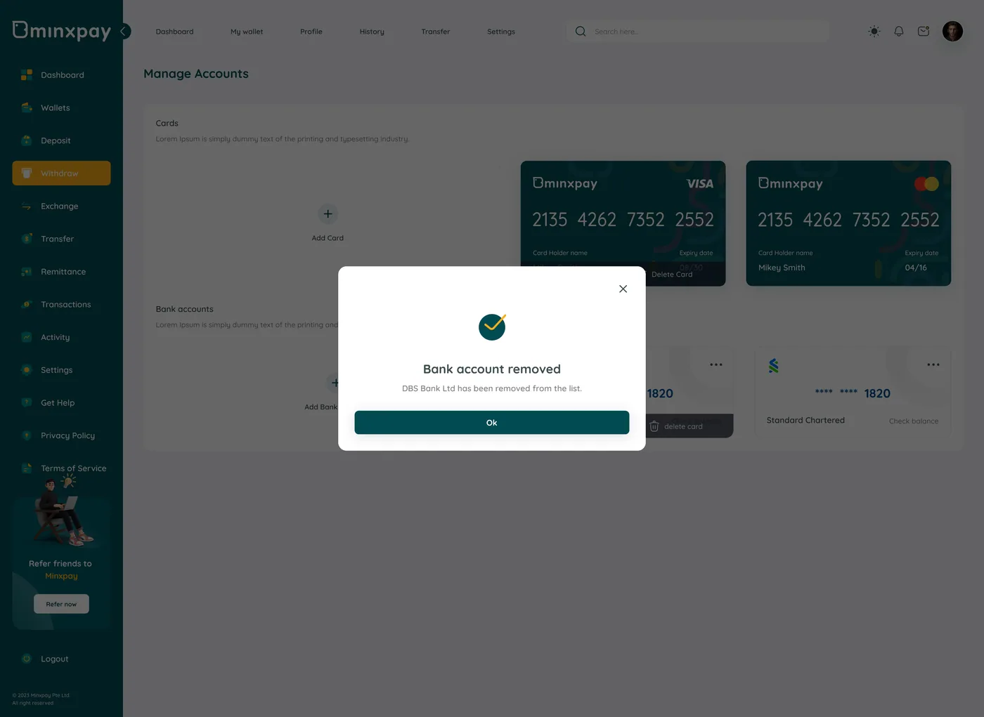
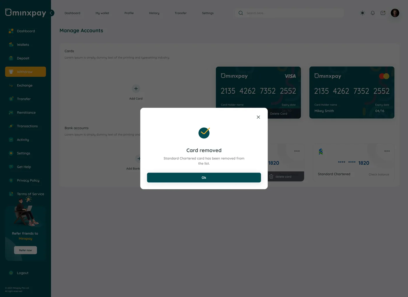
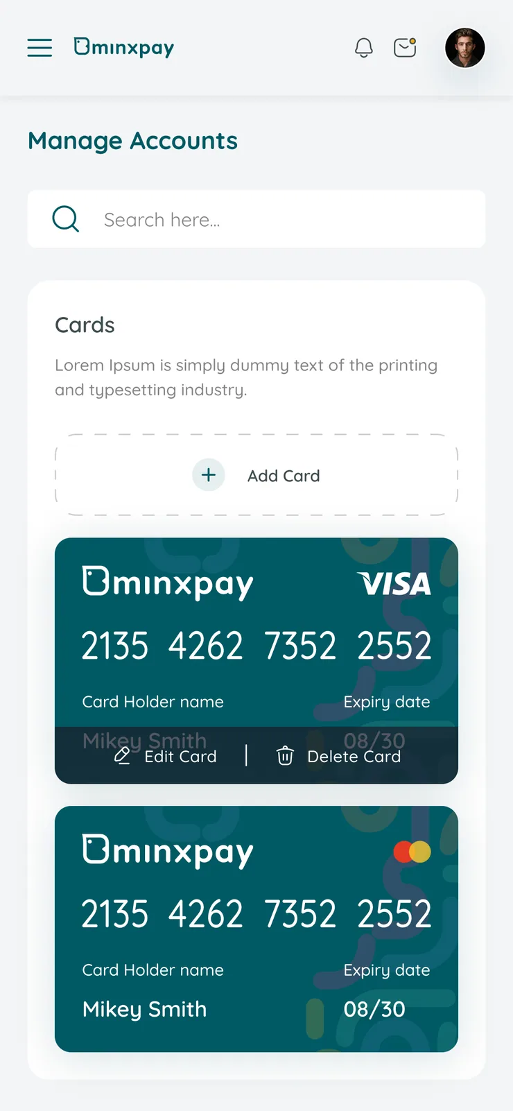
Cards and bank accounts change over time, and Manage Accounts treats edit and delete as first-class actions instead of something buried in a menu. Removing a linked account asks for confirmation naming the specific account ("remove Standard Chartered account?") instead of a generic warning, and every add/remove action gets its own success state confirming exactly what changed.

Minxpay card added confirmationMinxpay manage accounts screen with cards and bank accountsMinxpay confirmation dialog naming the Standard Chartered account to remove
Minxpay manage accounts screen, card menu openMinxpay bank account removed confirmationMinxpay card removed confirmation
The Minxpay dashboard on a laptop on a desk

Responsive

Every screen has a mobile companion, not a cut-down version.

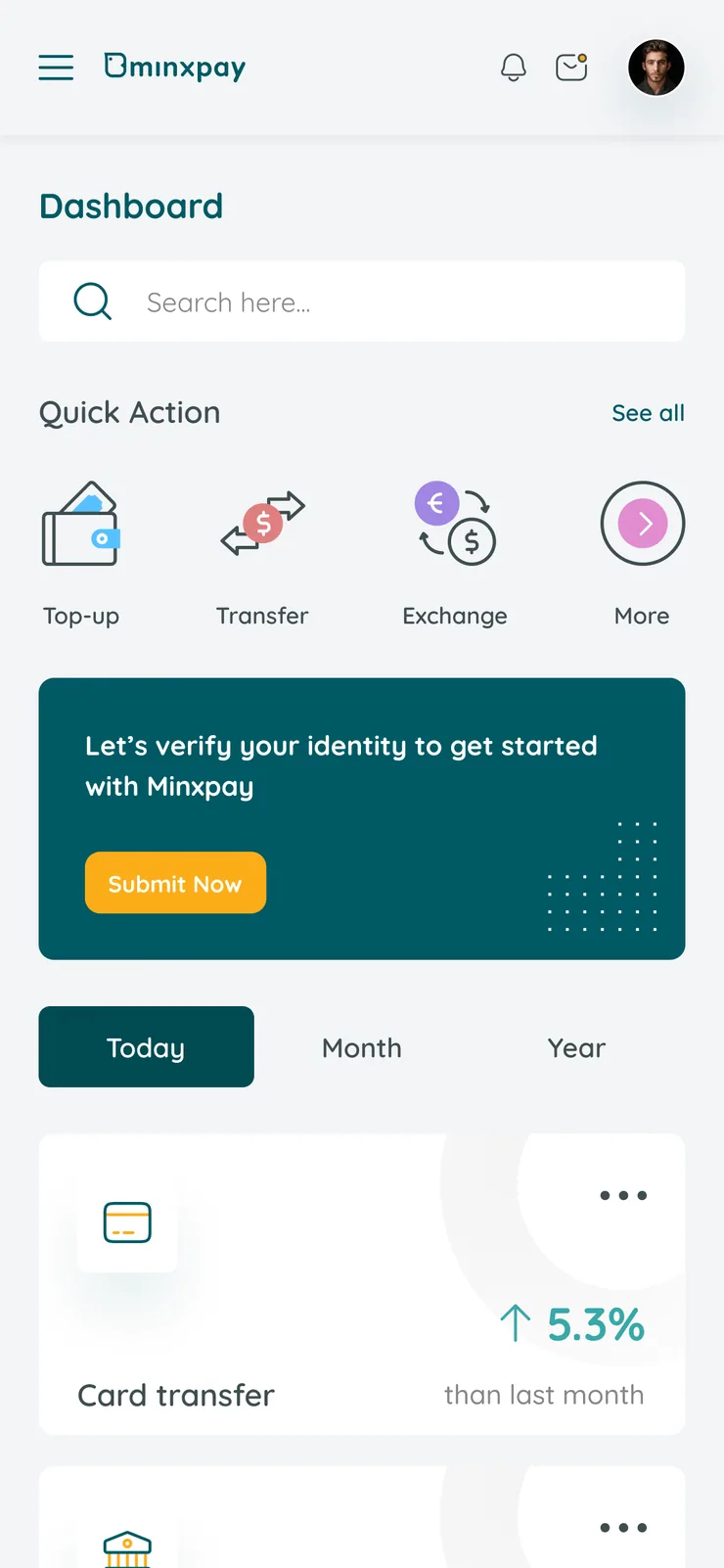
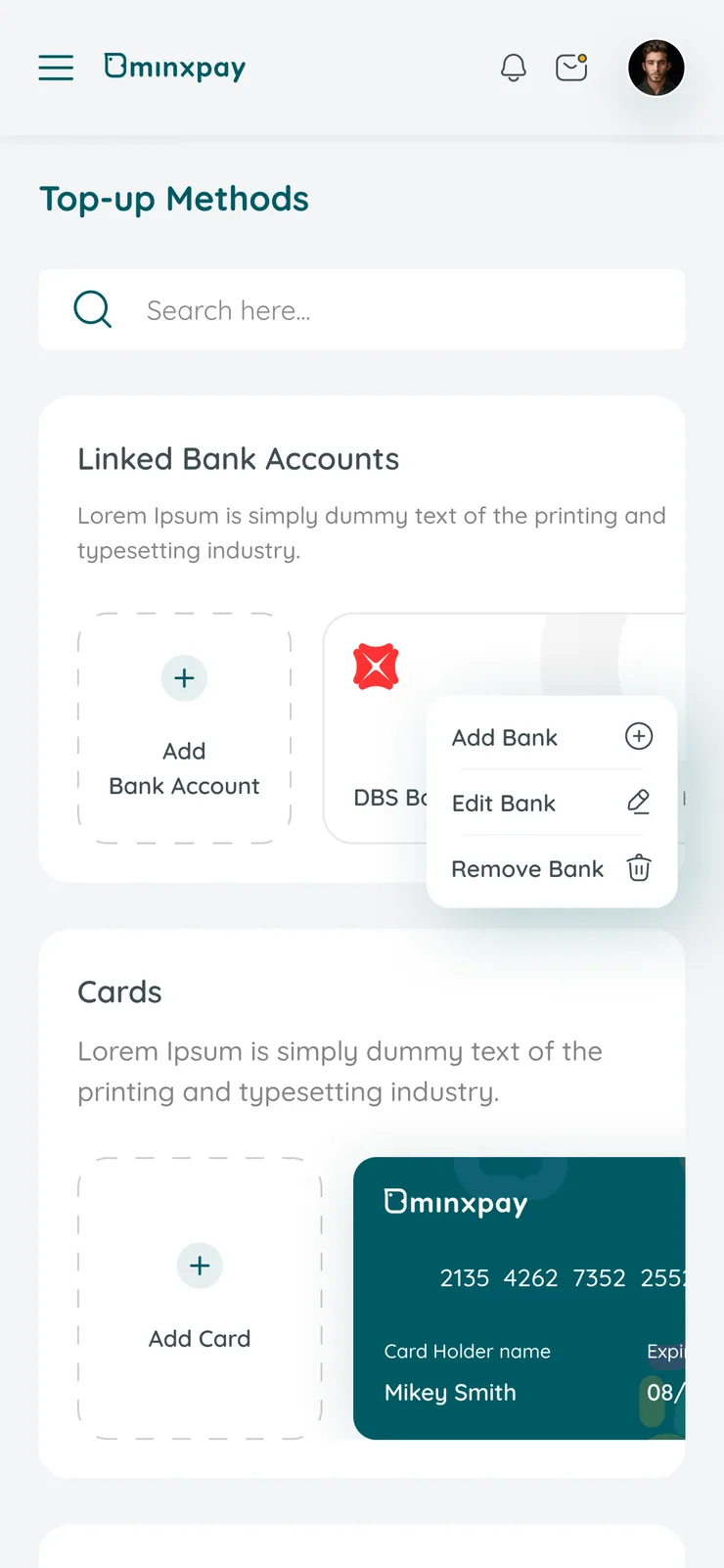
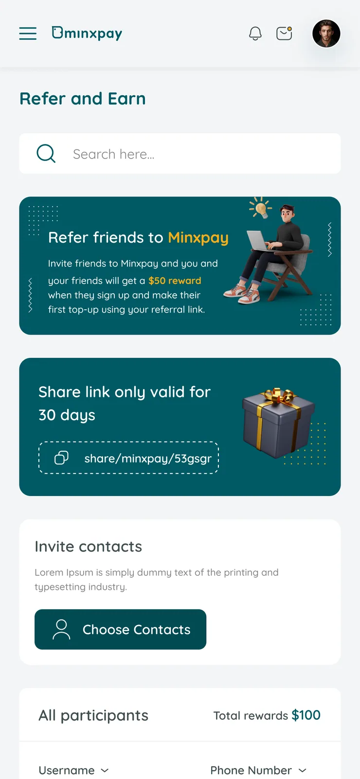
All 45 screens ship in a 375px mobile variant alongside the desktop layout. The 12-column desktop grid collapses to 4 columns, KPI cards stack instead of sitting side by side, and the transaction table becomes a scrollable list, but the flow, the labels and the verification steps stay identical, so a user moving between the two never has to relearn anything.

Minxpay mobile withdrawal review screenMinxpay mobile dashboardMinxpay mobile top-up methods screenMinxpay mobile refer and earn screenMinxpay mobile manage accounts screen

Visual language

Deep teal, one amber, Quicksand throughout.

Minxpay's palette leans on a deep teal as the primary color, a choice that reads as stable and banking-adjacent rather than trend-driven, with a single amber accent reserved for calls to action, so it never competes with the status colors doing real work elsewhere. Type is set in Quicksand, a rounded geometric sans that softens what could otherwise feel clinical on a money app, without sacrificing the legibility a transaction table needs.

  • #024B53
  • #FBAD18
  • #1B1D1F
  • #F3F5F7
  • #3F4E50
  • #D9D8D5
  • #858585
  • #FFFFFF

Typography

Before / After

What changed between the source flow and the redesign.

Three moments carried most of the friction. Each one is shown as it worked in the source flow, and as it works now.

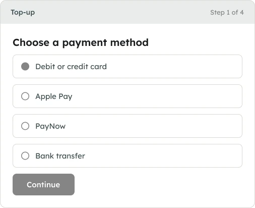
00Top-up screen, side by side

Before · ReconstructedWireframe of the first of four top-up pages: choose a payment method, with no balance or amount on screen

A wireframe reconstruction of the source flow, drawn from the project brief. It is not a screenshot of the old product. Step 1 of 4: the wallet balance and the amount are not on screen yet.

AfterThe shipped Minxpay top-up screen with balance, preset amounts and payment method together

The shipped Top-up screen. Balance, the $40 preset and the payment method stay on one screen, and every further choice opens as an overlay.

01Verification

Before
  • Sign-up OTP
  • Top-up code
  • Withdraw code
  • Bank-link code
  • Settings code

Five separate "enter code" screens, each with its own layout and behavior. Users relearn the check every time.

After
  • Passcode / Face ID shell
  • OTP shell

Two shells: biometric-first for in-app transactions, OTP reserved for account-level changes. Learned once, reused everywhere.

02Top-up

Before
  1. Method
  2. Currency
  3. Verify
  4. Result

Four decisions spread over four page loads. Balance and amount disappear after the first screen.

After
  1. Top-up screen
  2. Currency
  3. Apple Pay
  4. Verify
  5. Result

One persistent Top-up screen. Every choice opens as an overlay, so the running balance and the $40 preset stay visible throughout.

03Withdrawal review

Before
  1. Amount
  2. Confirm
  3. Receipt

Transaction ID and From/To appear only after the money has moved, so speed and auditability pull against each other.
After
  1. Amount
  2. Review = receipt
  3. Done

The review screen doubles as the receipt: Transaction ID and From/To are visible before the user confirms.

Results & Impact

Five money flows, one pattern learned once.

Every money-movement action in Minxpay (top-up, withdrawal, bank linking) now follows the same method → currency/account → verify → result shape. Five one-off verification screens became two consistent shells, and balance, amount, and account context stay in view from the first tap to the receipt.

  • 5 → 2one-off verification screens merged into two reusable shells
  • 4 → 1page loads in a top-up, now one screen with overlays
  • 100%of top-up and withdrawal steps keep balance and amount in view
  • 90screens shipped: 45 desktop, each with a mobile twin

Design-level outcomes measured against the source flow. Live conversion data will follow launch.

Learnings

What the next pass of Minxpay should resolve.

  1. The OTP/biometric split (passcode/Face ID for transactions, OTP for account changes) is applied screen by screen by convention, not documentation. A one-page micro-pattern spec would have saved redrawing the same code-entry layout five times and keeps future screens consistent.

  2. The transaction table doesn't yet distinguish who initiated an action (admin vs. account holder), which is worth resolving before treating this as a true multi-user admin surface.

  3. Keeping the base Top-up screen visible under every overlay (currency, Apple Pay, verification) works well for context, but it means every overlay has to be designed against a busy background. A cleaner separation of "decision layer" from "context layer" would simplify future additions.

  4. Designing every desktop screen with its mobile companion from the start kept flows, labels and verification steps identical across both, which was far easier than retrofitting a mobile layout later.

Building a digital wallet? We can help you ship it.

Thanks for reading.

Have a product like this? Let's talk. Book a call

Skip to content
Wait! Is Your Website Losing Customers?

Get a free UI/UX audit and discover what’s holding your site back