
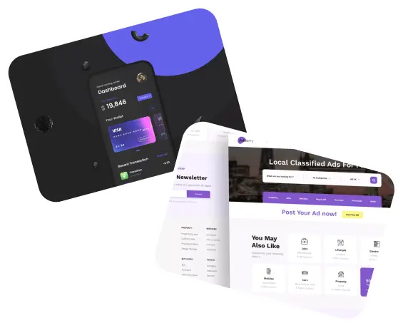










Understanding the Role of Color in Dashboard Design
Color plays a critical role in dashboard design, influencing user perception and interaction. It goes beyond aesthetics, impacting how data is interpreted and how effectively users can navigate through complex information. The psychology of color can guide designers in creating dashboards that are not only visually appealing but also functional and intuitive.
The Psychology Behind Color Choices
Colors can evoke emotions and influence decision-making. For instance, blue often represents trust and reliability, making it a popular choice for financial dashboards. Red, on the other hand, can signal urgency or alertness, ideal for highlighting critical issues or warnings. Understanding these associations helps in selecting colors that align with the intended message and function of the dashboard.
Color Associations and Cultural Differences
While certain colors have universal meanings, cultural differences can alter their perception. For example, while white is often associated with purity in Western cultures, it can signify mourning in some Eastern cultures. Designers must consider the cultural context of their audience to ensure the color scheme resonates appropriately.
Implementing Color Theory in Dashboard Design
Color theory provides a framework for combining colors harmoniously. By understanding concepts such as complementary, analogous, and triadic color schemes, designers can create dashboards that are both visually appealing and functional. These principles help in achieving balance, contrast, and emphasis, essential for an effective design.
Contrast and Readability
High contrast between background and text colors enhances readability, a crucial aspect of dashboard design. Using contrasting colors for different data sets can also help users distinguish between them quickly, facilitating better data comprehension and analysis.
Color Consistency Across Platforms
Maintaining color consistency across different devices and platforms is essential for brand recognition and user experience. This consistency helps in building familiarity and trust with users, ensuring they have a seamless experience regardless of how they access the dashboard.
Best Practices for Using Color in Dashboards
Effective use of color in dashboard design requires strategic planning and consideration of user needs. Here are some best practices:
Minimalistic Approach
Less is often more when it comes to color in dashboards. A minimalistic approach reduces cognitive load and prevents users from feeling overwhelmed. Limiting the color palette to a few key colors can make the dashboard more digestible and user-friendly.
Highlighting and Prioritization
Utilize color to highlight important information and guide users’ attention to critical data points. This can be achieved by using brighter colors for key metrics or alerts, ensuring they stand out from less critical information.
Testing and User Feedback
Testing different color schemes with real users can provide valuable feedback on what works best. User feedback helps in refining the design to better meet user preferences and improve overall satisfaction.
Common Mistakes in Color Usage
Avoiding common pitfalls in color usage can enhance the effectiveness of a dashboard. Here are some mistakes to watch out for:
Overuse of Colors
Using too many colors can lead to confusion and distract from the data. It’s important to maintain a cohesive color scheme that supports the dashboard’s objectives rather than detracts from them.
Ignoring Accessibility
Accessibility should be a top priority in dashboard design. This includes ensuring that color choices are visible to users with color vision deficiencies. Tools like color contrast checkers can help in evaluating and improving accessibility.
FAQ: Color in Dashboard Design
What is the most effective color for a dashboard?
There isn’t a one-size-fits-all answer, as the most effective color depends on the dashboard’s purpose and audience. However, neutral colors like blues and grays are often safe choices as they are calming and professional.
How can I ensure my dashboard is accessible to colorblind users?
Use high-contrast color combinations and avoid relying solely on color to convey information. Incorporating patterns or symbols can also assist users with color vision deficiencies.
Should I use different colors for different data sets?
Yes, using different colors for different data sets can help users quickly differentiate between them. However, ensure the colors are distinct enough to be easily distinguishable.
Can color improve the usability of a dashboard?
Absolutely. When used correctly, color can enhance usability by highlighting important information, improving navigation, and making the dashboard more intuitive.
Conclusion
The psychology of color in dashboard design is a powerful tool that, when used effectively, can significantly enhance user experience and data comprehension. By understanding color psychology, implementing color theory, and adhering to best practices, designers can create dashboards that not only look good but also function well, ultimately leading to better decision-making and increased productivity.